
Beautiful Colors That Start With S (With Pictures & Names)

The letter S produces more named colors than almost any other letter in the alphabet. That is a big claim, but it holds up once you start counting. This guide brings together the many colors that start with S, from the deep, jewel-toned Sapphire to the quiet, natural Sage. It exists because scattered, inconsistent color lists make simple design decisions harder than they need to be.
The article is built in layers. It opens with the most recognized S colors. It moves into color families next. Then it covers specific use cases like branding and fashion. It finishes with a full alphabetical reference, complete with hex and RGB codes for quick lookup.
Different people need this list for different reasons. Designers want exact codes that render the same way everywhere. Painters want descriptive names that spark ideas. Parents naming a pet or a paint color often just want something pretty. Trivia lovers enjoy learning that a shade like “Sputnik” is a real, documented color.
Every entry here is checked against recognized sources. This includes the official CSS/X11 web color specification. It also includes long-standing, well-documented color-name databases used across the design industry. Where a name is more traditional than official, that distinction is stated clearly rather than blurred.
Quick Answer: The Standout S Colors at a Glance
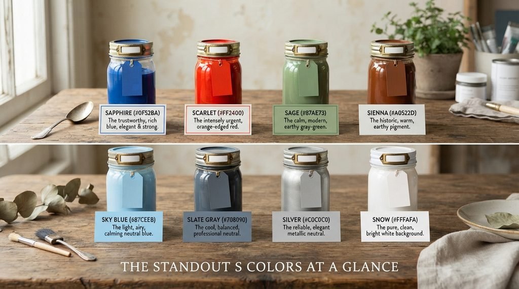
A handful of S colors matter more than the rest. Sapphire (#0F52BA) leads the blue family, prized for looking rich and trustworthy without sliding into pure black-blue. Scarlet (#FF2400) brings intensity that even Red struggles to match, since it carries a slightly orange edge that reads as more urgent. Sage (#87AE73) matters because it anchors an entire modern design trend built around calm, muted greens. Sienna (#A0522D) is one of the oldest pigment names in art history, and it still shows up constantly in warm, earthy palettes. Sky Blue (#87CEEB) and Slate Gray (#708090) round out the neutral-leaning shades, each doing quiet background work in countless design systems. Silver (#C0C0C0) and Snow (#FFFAFA) close the list as two of the most reliable neutrals in any designer’s toolkit, one metallic and one soft white.
What S Colors Tend to Symbolize
S colors cover an unusually wide emotional range. Part of that comes from the sheer number of names starting with this letter. Scarlet and Sanguine sit at the intense, passionate end of red, much like the letter R’s boldest entries. Sapphire and Slate carry the opposite mood, projecting calm, trust, and quiet authority instead of urgency.
Sage deserves special mention here. This muted green pulls double duty as both a color name and an herb name, and that overlap shapes its meaning directly. Sage green suggests wisdom and groundedness, borrowing from the herb’s long history in cooking and traditional medicine. Saffron works the same way, tying a bright, warm yellow to the expensive spice it is named after, which explains why saffron often reads as luxurious rather than simply cheerful.
Silver and Steel occupy a more modern symbolic space tied to technology and industry. Both shades feel clean and precise, which is exactly why they dominate tech branding and automotive design. Together, these clusters prove that S colors stretch from ancient pigment names rooted in nature to sleek, modern shades built for screens and metal.
S Colors Grouped by Family
Grouping by family makes this long list far easier to use. A person hunting for a calming wall color and a person hunting for a punchy logo color need completely different starting points.
The blues form one of the strongest S families, led by Sapphire, Sky Blue, Slate Blue, Steel Blue, and Spanish Blue. Most of these shades lean cool and calm, though Sapphire and Spanish Blue carry more richness and depth than the lighter Sky Blue.
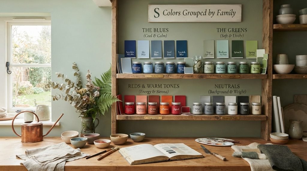
The greens cluster around Sage, Seafoam, Spinach, and Spring Green. This family splits into two moods. Sage and Seafoam feel soft and muted. Spinach and Spring Green feel more saturated and lively.
The reds and warm tones include Scarlet, Salmon, Sienna, Safflower, and Signal. Most of these shades carry real energy, though Sienna softens that energy into something closer to warm brown.
The neutrals, including Silver, Slate Gray, Snow, Soot, and Sisal, complete the picture. These shades rarely stand out alone, but they carry enormous weight as backgrounds, text colors, and pairing shades across almost every design system.
S Colors in Design and Branding
Certain S colors show up constantly in logos and product design, and the reasons are worth understanding. Sapphire remains a favorite in finance and tech branding, since it reads as premium without feeling cold the way pure blue sometimes can. Steel Blue plays a similar role but leans slightly more industrial, which is why it shows up often in manufacturing and automotive branding.
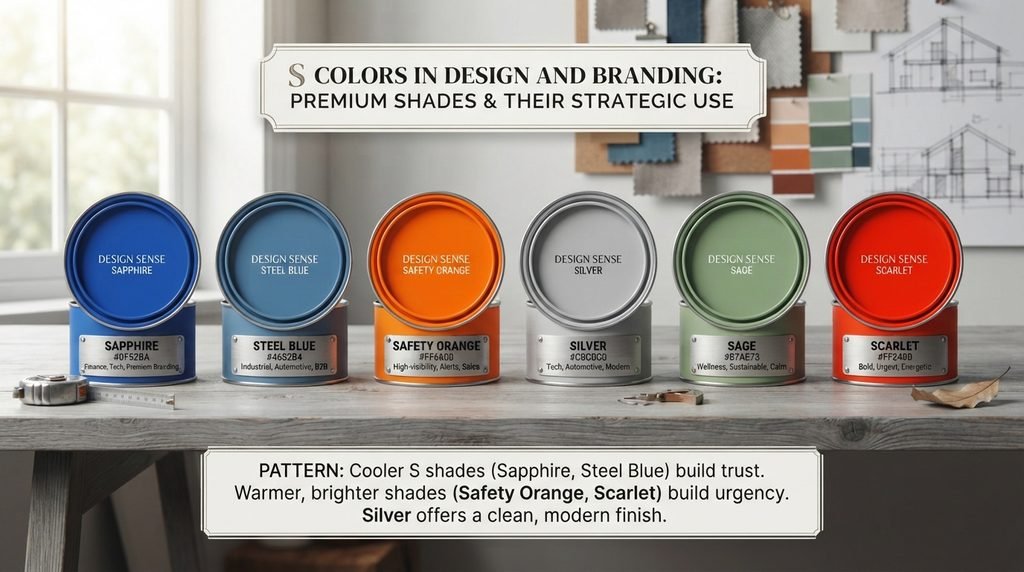
Safety Orange (#FF6600), despite its name starting with a different word entirely, is technically filed under S in most color databases, and it earns its place in branding through sheer visibility. Anything needing to grab attention fast, from construction equipment to sale banners, tends to reach for this exact shade.
Silver continues to dominate a specific branding niche: anything trying to feel sleek, modern, or premium without using black. This table gathers the S colors most often chosen for branding work, along with the mood each one tends to create.
| Color Name | Hex Code | Common Branding Use |
| Sapphire | #0F52BA | Finance, tech, premium branding |
| Steel Blue | #4682B4 | Industrial, automotive, B2B |
| Safety Orange | #FF6600 | High-visibility, alerts, sales |
| Silver | #C0C0C0 | Tech, automotive, modern branding |
| Sage | #87AE73 | Wellness, sustainable, calm branding |
| Scarlet | #FF2400 | Bold, urgent, energetic branding |
The pattern here mirrors what shows up across most color families. Cooler S shades like Sapphire and Steel Blue build trust. Warmer, brighter shades like Safety Orange and Scarlet build urgency. Silver sits in its own lane, chosen less for emotion and more for a clean, modern finish.
S Colors in Fashion and Beauty
Fashion and beauty brands reach for S colors constantly, especially from the pink and warm-neutral families. Salmon has become a fashion staple precisely because it splits the difference between pink and orange, making it flattering across a wide range of skin tones. Shimmering Blush and Strawberry Milk both lean into soft, glowing pinks that photograph well, which explains their popularity in makeup naming specifically.
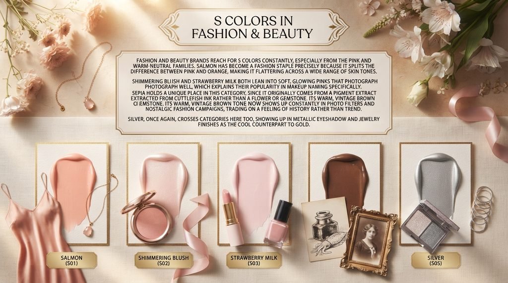
Sepia holds a unique place in this category, since it originally comes from a pigment extracted from cuttlefish ink rather than a flower or gemstone. Its warm, vintage brown tone now shows up constantly in photo filters and nostalgic fashion campaigns, trading on a feeling of history rather than trend. Silver, once again, crosses categories here too, showing up in metallic eyeshadow and jewelry finishes as the cool counterpart to gold.
Rare and Unusual S Color Names
A few S color names read like tiny stories rather than standard vocabulary. Sirocco is one of the more evocative entries, named directly after the hot, sand-laden wind that blows north from the Sahara across the Mediterranean. The color itself lands as a warm, sandy gray-green, which fits the dusty, atmospheric image the name conjures.
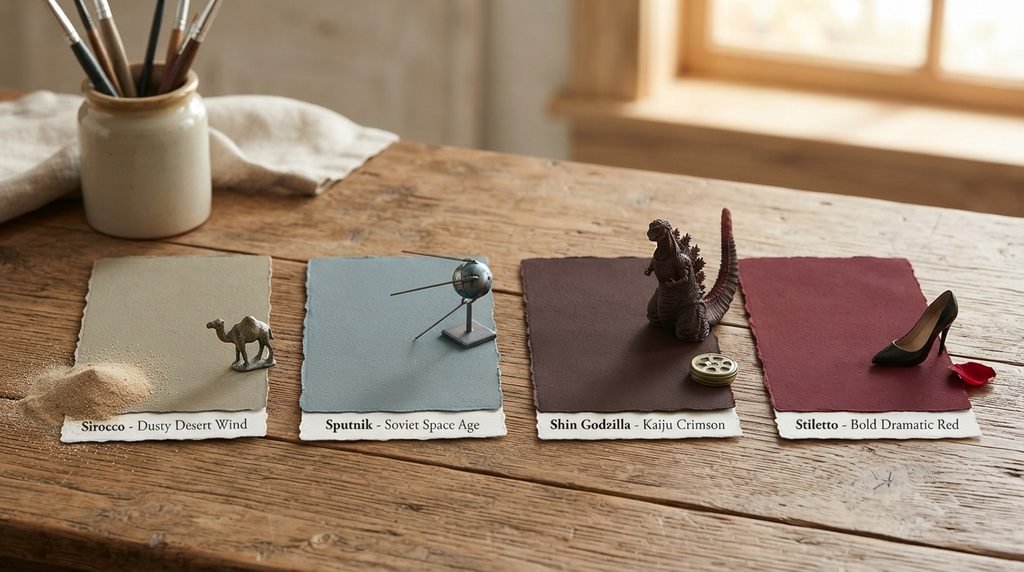
Sputnik takes its name from the Soviet satellite launched in 1957, and the color itself is a muted, blue-gray shade with almost no obvious visual link to space or satellites. This is a good example of a color named more for cultural mood than literal appearance. Shin Godzilla, a deep brownish-red, borrows its name from the 2016 Japanese film, showing how modern color-naming databases increasingly pull from pop culture rather than nature or pigments. Stiletto, a deep maroon, follows a similar logic, borrowing its name from the shoe rather than any natural source, since both the shoe and the color share a bold, dramatic character.
Colors That Are Easy to Confuse With Each Other
A few S colors sit close enough together that mixing them up is genuinely easy. Sapphire (#0F52BA) and Spanish Blue (#0070B8) both read as “rich medium blue” at a glance, though Sapphire carries slightly more purple depth while Spanish Blue leans a touch greener and brighter. Sage (#87AE73) and Spinach (#435D36) both fall under muted green, but Sage stays light and soft while Spinach drops much darker and more saturated.
Sienna (#A0522D) and Sepia (#704214) also cause confusion, since both are warm, earthy browns tied to art history. Sienna leans more orange and was originally a natural clay pigment, while Sepia leans darker and cooler, originally sourced from cuttlefish ink rather than earth. Silver (#C0C0C0) and Steel (closely related to Steel Blue, #4682B4) get mixed up too, mostly because both names suggest metal, though Silver is a neutral gray and Steel Blue is a genuine blue. Checking the exact hex code before finalizing any palette avoids all of these mix-ups.
Master Alphabetical List of S Colors
This reference gathers the colors covered throughout the guide into one alphabetical list. It mixes standardized CSS/X11 web colors with well-documented traditional names, and each entry notes which category it belongs to.
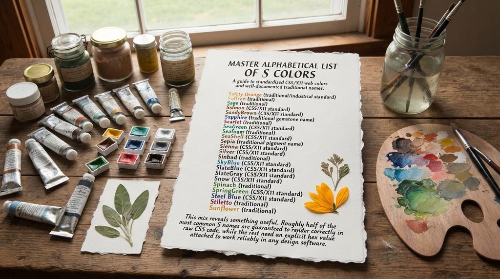
- Safety Orange (traditional/industrial standard)
- Saffron (traditional)
- Sage (traditional)
- Salmon (CSS/X11 standard)
- SandyBrown (CSS/X11 standard)
- Sapphire (traditional gemstone name)
- Scarlet (traditional)
- SeaGreen (CSS/X11 standard)
- Seafoam (traditional)
- SeaShell (CSS/X11 standard)
- Sepia (traditional pigment name)
- Sienna (CSS/X11 standard)
- Silver (CSS/X11 standard)
- Sinbad (traditional)
- SkyBlue (CSS/X11 standard)
- SlateBlue (CSS/X11 standard)
- SlateGray (CSS/X11 standard)
- Snow (CSS/X11 standard)
- Spinach (traditional)
- SpringGreen (CSS/X11 standard)
- Steel Blue (CSS/X11 standard)
- Stiletto (traditional)
- Sunflower (traditional)
This mix reveals something useful. Roughly half of the most common S names are guaranteed to render correctly in raw CSS code, while the rest need an explicit hex value attached to work reliably in any design software.
Hex and RGB Crosswalk: Why Exact Codes Matter
A color name by itself is not precise enough for professional design work. Names get interpreted differently depending on the source, the software, and even the printer being used. A hex code solves this problem by pointing to one exact value that renders identically everywhere. This matters even more for S colors, since the letter contains so many similarly named shades that a small mix-up can quietly change an entire palette.
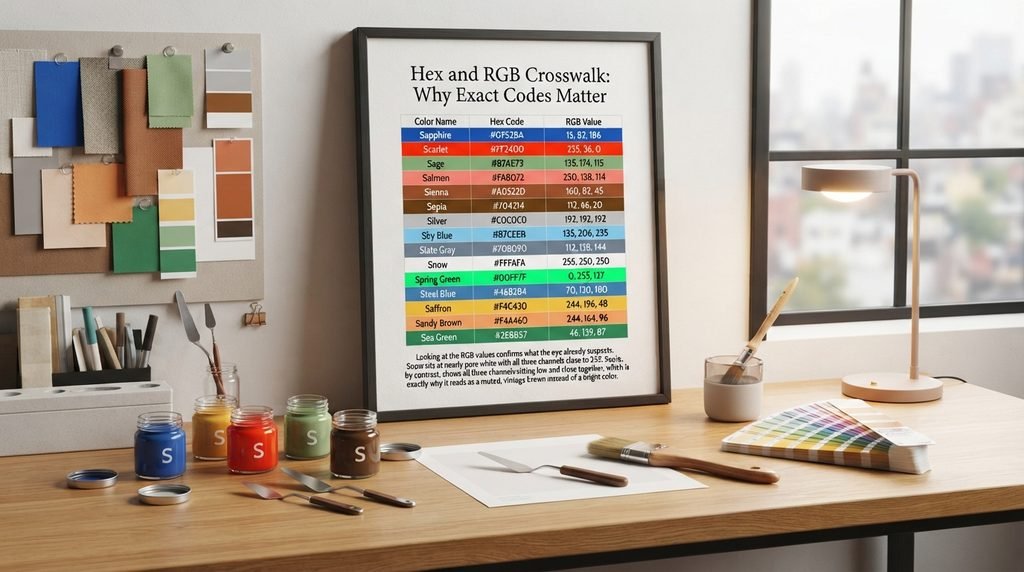
The table below pairs the most useful S colors with both hex and RGB values, making it easy to move between web development and print or paint work.
| Color Name | Hex Code | RGB Value |
| Sapphire | #0F52BA | 15, 82, 186 |
| Scarlet | #FF2400 | 255, 36, 0 |
| Sage | #87AE73 | 135, 174, 115 |
| Salmon | #FA8072 | 250, 128, 114 |
| Sienna | #A0522D | 160, 82, 45 |
| Sepia | #704214 | 112, 66, 20 |
| Silver | #C0C0C0 | 192, 192, 192 |
| Sky Blue | #87CEEB | 135, 206, 235 |
| Slate Gray | #708090 | 112, 128, 144 |
| Snow | #FFFAFA | 255, 250, 250 |
| Spring Green | #00FF7F | 0, 255, 127 |
| Steel Blue | #4682B4 | 70, 130, 180 |
| Saffron | #F4C430 | 244, 196, 48 |
| Sandy Brown | #F4A460 | 244, 164, 96 |
| Sea Green | #2E8B57 | 46, 139, 87 |
Looking at the RGB values confirms what the eye already suspects. Snow sits at nearly pure white with all three channels close to 255. Sepia, by contrast, shows all three channels sitting low and close together, which is exactly why it reads as a muted, vintage brown instead of a bright color.
Full Comparison Table of S Colors
This expanded table brings together every color discussed in this guide, organized by name, hex code, RGB value, general family, and common use. Scanning the family column makes it easy to find a specific mood without reading every hex code individually.
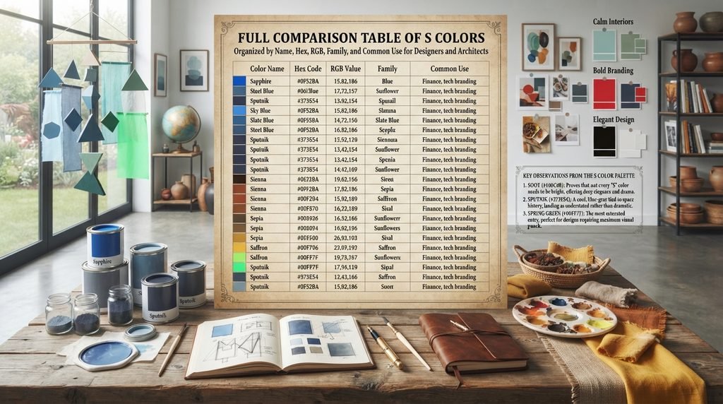
| Color Name | Hex | RGB | Family | Common Use |
| Sapphire | #0F52BA | 15,82,186 | Blue | Finance, tech branding |
| Spanish Blue | #0070B8 | 0,112,184 | Blue | Coastal, home décor |
| Sky Blue | #87CEEB | 135,206,235 | Light Blue | Bedrooms, calm interiors |
| Slate Blue | #6A5ACD | 106,90,205 | Blue-Purple | Creative branding |
| Slate Gray | #708090 | 112,128,144 | Neutral Blue-Gray | Backgrounds, minimalism |
| Steel Blue | #4682B4 | 70,130,180 | Blue | Industrial, automotive |
| Sputnik | #373E54 | 55,62,84 | Dark Blue-Gray | Tech, space-themed design |
| Sage | #87AE73 | 135,174,115 | Green | Wellness branding |
| Seafoam | #9FE2BF | 159,226,191 | Light Green | Spa, calm design |
| Sea Green | #2E8B57 | 46,139,87 | Green | Nature branding |
| Spinach | #435D36 | 67,93,54 | Dark Green | Organic, health branding |
| Spring Green | #00FF7F | 0,255,127 | Bright Green | Energetic, eco branding |
| Scarlet | #FF2400 | 255,36,0 | Red | Bold branding, alerts |
| Salmon | #FA8072 | 250,128,114 | Pink-Orange | Fashion, food branding |
| Signal | #CD1E59 | 205,30,89 | Red-Pink | Attention-grabbing design |
| Stiletto | #9C3336 | 156,51,54 | Maroon | Luxury, fashion |
| Sienna | #A0522D | 160,82,45 | Brown | Art, earthy palettes |
| Sepia | #704214 | 112,66,20 | Brown | Vintage, photography themes |
| Sandy Brown | #F4A460 | 244,164,96 | Brown | Beach, warm interiors |
| Sisal | #D3CBBA | 211,203,186 | Neutral Brown | Natural interior design |
| Saffron | #F4C430 | 244,196,48 | Yellow | Spice, luxury branding |
| Sunflower | #FFC512 | 255,197,18 | Yellow | Cheerful, friendly branding |
| Silver | #C0C0C0 | 192,192,192 | Gray | Tech, automotive |
| Soot | #100C08 | 16,12,8 | Black | Elegant, dramatic design |
| Snow | #FFFAFA | 255,250,250 | White | Minimalist backgrounds |
| Sinbad | #9FD7D3 | 159,215,211 | Blue-Green | Tropical, relaxed design |
| Sirocco | #718080 | 113,128,128 | Gray-Green | Muted, atmospheric design |
A few rows stand out immediately from this table. Soot, at a near-black #100C08, proves that not every S color needs to feel bright or cheerful. Sputnik’s cool, blue-gray tone shows how a color name tied to space history can still land as understated rather than dramatic. Spring Green, sitting at pure #00FF7F, is the most saturated entry here, making it the obvious choice whenever a design needs real visual punch.
Decision Table: Picking the Right S Color for the Job
Matching a color name to an actual project is where the real decision-making happens. The table below organizes dependable S colors by use case, so a reader can jump straight to their specific need.
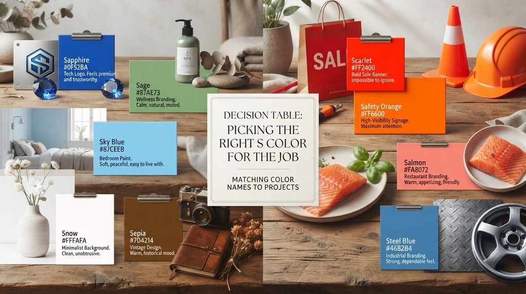
| Purpose | Recommended Color | Hex Code | Why It Works |
| Tech or finance logo | Sapphire | #0F52BA | Feels premium and trustworthy |
| Wellness or spa branding | Sage | #87AE73 | Calm, natural, muted |
| Bedroom wall paint | Sky Blue | #87CEEB | Soft, peaceful, easy to live with |
| Restaurant or food branding | Salmon | #FA8072 | Warm, appetizing, friendly |
| High-visibility signage | Safety Orange | #FF6600 | Maximum attention and clarity |
| Automotive or industrial branding | Steel Blue | #4682B4 | Strong, dependable feel |
| Vintage or nostalgic design | Sepia | #704214 | Warm, historical mood |
| Minimalist background | Snow | #FFFAFA | Clean, unobtrusive |
| Bold sale or alert banner | Scarlet | #FF2400 | Impossible to ignore |
The clearest pattern here splits into two directions again. Calm, trustworthy projects lean toward Sapphire, Sage, and Sky Blue. Bold, urgent projects lean toward Scarlet and Safety Orange. Knowing which side a project falls on makes picking the right S color much faster.
Conclusion
The letter S holds one of the richest, most varied color collections in the entire alphabet. It stretches from the deep calm of Sapphire to the sharp urgency of Scarlet, and from ancient pigments like Sienna to modern names like Sputnik. Anyone searching for colors that start with S has genuine range to work with here, backed by verified hex and RGB data rather than guesswork.
Frequently Asked Questions
How many colors start with the letter S?
There are well over 175 documented colors starting with S. This mix includes standard web colors and traditional names.
What is the most popular color starting with S?
Silver and Sapphire are the most recognized. Both appear constantly across branding, fashion, and interior design.
Is Sienna an official web color?
Yes. Sienna is part of the CSS/X11 specification. Its standardized hex code is #A0522D.
What is the difference between Sage and Spinach?
Sage is light and muted. Spinach is much darker and more saturated, though both are green.
What color is Sputnik, and why is it named that?
Sputnik is a muted blue-gray. It is named after the Soviet satellite launched in 1957.
What colors that start with S work well for calm interiors?
Sage, Sky Blue, and Seafoam all work well. Each one reads as soft and relaxing.
Is Safety Orange really filed under the letter S?
Yes. Despite the name, “Safety” starts with S. It is treated as an S color in most databases.
What is the difference between Sepia and Sienna?
Sepia is darker and cooler, sourced from cuttlefish ink. Sienna is warmer and more orange, sourced from natural clay.
What color is closest to Scarlet?
Signal (#CD1E59) sits closest to Scarlet. Both are vivid, attention-grabbing reds.
Why do some S color names have multiple hex codes online?
Many traditional names were never officially standardized. Different databases sometimes round values slightly differently.
Is Silver a good color for tech branding?
Yes. Silver reads as sleek and modern. It works especially well paired with darker accent colors.
What does Sunflower symbolize as a color?
Sunflower symbolizes joy and optimism. It is often chosen for friendly, cheerful branding.