
Colors That Start With H: Popular, Rare & Unique Shades

Colors that start with H run smaller than most letters, but they punch above their weight. Hot Pink and Harlequin are loud and unmistakable. Heliotrope and Han Purple sit further out, tied to real historical pigments most people never learn the name of.
This list only includes colors with a real, checkable source. That means CSS/X11 web standards, documented university and sports team colors, or long-established pigment names with a citation trail going back over a century. Every hex code here was cross-checked against at least two sources before it made the cut.
That cross-checking mattered more than usual for this letter. One informal source listed “Hot Magenta” at one hex code, while another listed it at a different one entirely. Rather than guess, we left it out. What remains is 16 real colors that start with H, each backed by a source that agrees with at least one other.
The list below groups colors by family, then by use. Designers will find bold, energetic pinks here. Historians will find genuine ancient pigment names. Anyone curious about where a color like Heliotrope comes from can browse freely, since every entry is backed by a source you can check yourself.
Quick Answer: Standout H Colors
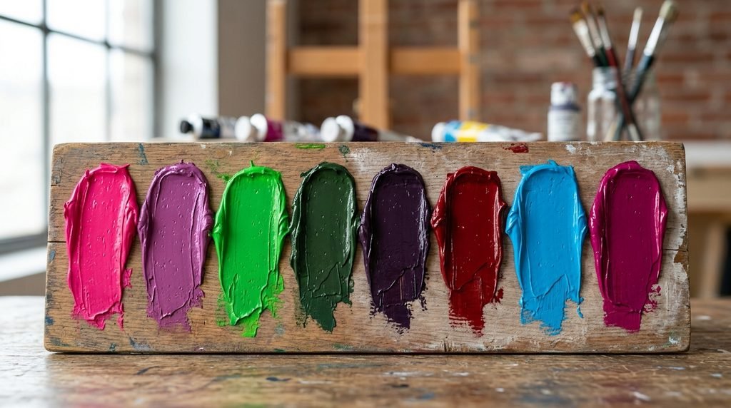
Short on time? Here are eight “H” colors worth knowing first. Hot Pink (#FF69B4) is a bold, saturated pink used across fashion and branding. Heliotrope (#DF73FF) offers a vivid pink-purple named after the flower. Harlequin (#3FFF00) delivers one of the brightest, most electric greens in common use.
Hunter Green (#355E3B) provides a deep, muted green tied to outdoor and hunting apparel. Han Purple (#5218FA) carries genuine ancient Chinese pigment history. Harvard Crimson (#C90016) ties directly to one of the most recognized university brand colors in the world. Honolulu Blue (#006DB0) borrows its name from the Detroit Lions’ official team color. Hollywood Cerise (#F400A1) delivers a bold, glamorous pink-magenta. Each of these earns its spot through wide recognition, not alphabetical luck.
What H Colors Mean and Evoke
Color names carry emotional weight, and the “H” group leans toward boldness, energy, and historical depth. Hot Pink and Hollywood Cerise both suggest confidence and glamour, tied closely to fashion and entertainment rather than anything subdued. Harlequin carries a similar intensity but reads as playful and theatrical, borrowing its name from the classic diamond-patterned costume character.
Heliotrope and Han Purple both carry a quieter, more mysterious weight. Heliotrope takes its name and tone from a flower once believed to have mystical properties, and Victorian mourning fashion later adopted it during the final, lighter stage of grief. Han Purple reaches back even further, tied to a pigment first synthesized in ancient China over two thousand years ago.
Hunter Green and Hooker’s Green both lean grounded and practical, evoking the outdoors rather than luxury or drama. Harvard Crimson and Honolulu Blue both carry institutional pride, borrowed directly from university and sports team branding rather than nature or emotion.
Color Families: Where H Colors Belong
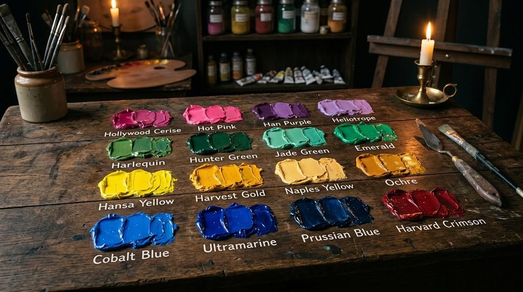
Pinks and Magentas
Hollywood Cerise, Hot Fuchsia, and Hot Pink anchor this bold family. Hot Pink stays the most universally recognized, while Hollywood Cerise pushes slightly more toward magenta. Hot Fuchsia sits close to both, distinguished mainly by a marginally cooler undertone.
Purples
Han Purple and Heliotrope, along with the softer Heliotrope Gray, make up this family. Han Purple reads bold and saturated, tied to ancient pigment chemistry, while Heliotrope stays lighter and more floral. Heliotrope Gray mutes the concept considerably, trading vividness for a soft, dusty neutral.
Greens
Harlequin, Hooker’s Green, Hunter Green, and Honeydew cover a huge range within this single family. Harlequin sits at the electric, neon-bright edge, while Hunter Green anchors the deep, muted end. Hooker’s Green, a genuine traditional watercolor pigment, lands in between, and Honeydew stays so pale it barely reads as green at all.
Yellows and Golds
Hansa Yellow and Harvest Gold cover this smaller family. Hansa Yellow is a real chemical pigment name, still used in the art supply industry today. Harvest Gold leans warmer and more orange, closely tied to a specific era of interior design and appliance color trends.
Blues
Han Blue and Honolulu Blue anchor this family. Han Blue shares its ancient Chinese pigment origin with Han Purple, while Honolulu Blue is a modern branding color, officially tied to an NFL team’s uniform.
Reds and Oranges
Harvard Crimson and Heat Wave round out this group. Harvard Crimson stays deep and formal, tied directly to the university’s branding. Heat Wave pushes brighter and more energetic, reading closer to a true orange than any shade of red.
Design & Branding Favorites
Certain “H” colors show up constantly in branding work. Hot Pink dominates fashion and beauty branding, chosen for maximum visual impact. Harvard Crimson and Honolulu Blue both function as institutional colors, locked into place by decades of university and sports branding history. Hunter Green appears often in outdoor and heritage branding, valued for its grounded, trustworthy read.
Below is a quick reference for how four of these colors typically get used in real design work. Notice how the saturated entries lean toward bold consumer branding, while the institutional colors stay fixed and rarely change.
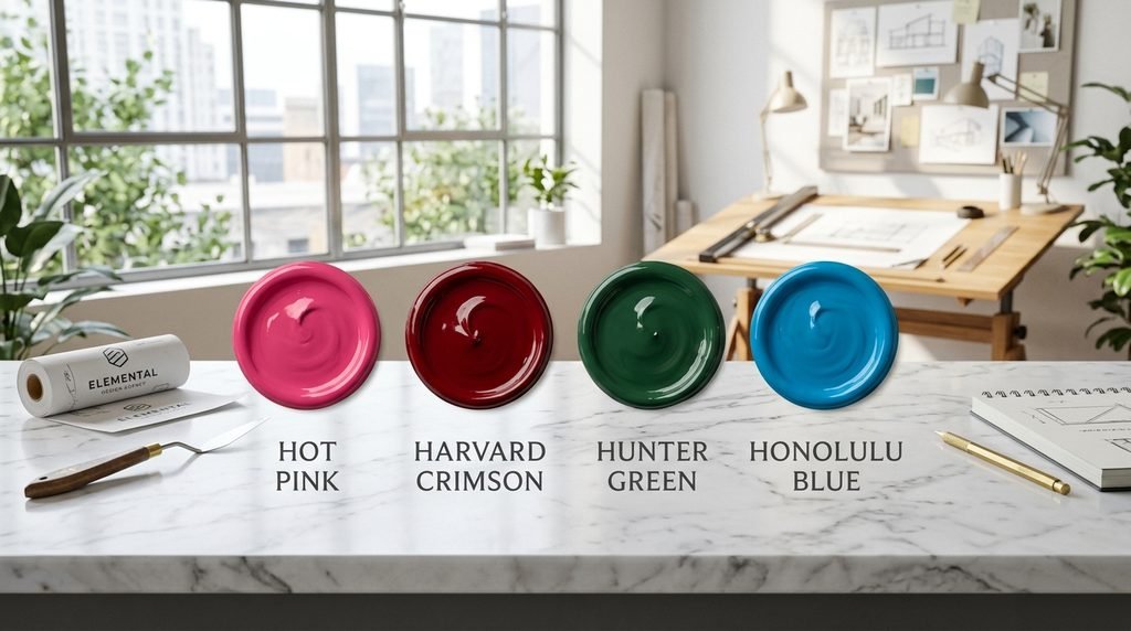
| Color | Hex | Typical Use |
| Hot Pink | #FF69B4 | Fashion, beauty branding |
| Harvard Crimson | #C90016 | University, institutional branding |
| Hunter Green | #355E3B | Outdoor, heritage branding |
| Honolulu Blue | #006DB0 | Sports team branding |
Hot Pink and Hunter Green rarely appear together in the same palette, since one is built for energy and the other for restraint. Harvard Crimson and Honolulu Blue both function best as fixed brand anchors rather than flexible design choices, since both are tied to specific, well-known institutions.
Fashion & Beauty Shades
Fashion leans heavily on a small set of “H” names. Hot Pink remains one of the most requested colors in both clothing and cosmetics, valued for reading as confident and youthful rather than soft. Heliotrope crosses over into beauty branding fairly often, since its cool, floral purple pairs naturally with fragrance and skincare lines.
Hollywood Cerise deserves a mention here too, since its name ties it directly to glamour and entertainment rather than nature or tradition. Its intensity sets it apart from a color like Heliotrope, which leans softer and more romantic despite sitting in a similar part of the color wheel.
Nature-Inspired Names
Several “H” colors borrow directly from the natural world. Heliotrope takes its name and tone from the flower itself, one of the more direct nature-to-color connections in this letter group. Hunter Green ties to the outdoors more through activity than direct imagery, historically associated with hunting apparel designed to blend into deep woodland.
Honeydew references the pale, soft green of the melon, while Hooker’s Green, despite sounding invented, was named after the 19th-century botanical illustrator William Hooker rather than any plant directly. Harlequin, by contrast, breaks from the nature pattern entirely, drawing its name from a costume character instead of anything found outdoors.
Rare or Unusual H Color Names
Some “H” colors rarely surface outside specialist circles, but each has a real story behind it. Han Purple and Han Blue both carry genuine ancient history, first synthesized in China during the Han dynasty as some of the earliest known artificial pigments in human history. Modern chemists still study both colors today, partly because their exact production methods were lost for centuries before being rediscovered.
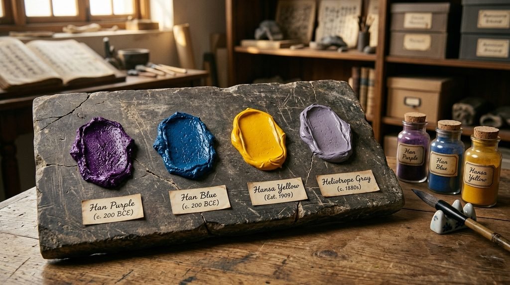
Hansa Yellow, despite sounding like a made-up brand name, is a real chemical pigment still manufactured and sold in art supply stores under that exact name. Heliotrope Gray earns its place through more recent but still well-documented history, first recorded as a color name in English back in 1912. Each of these names shows that “obscure” in the “H” family usually means “historically or chemically specific,” not “made up.”
- Han Purple (#5218FA) — ancient Chinese pigment, among the earliest synthetic colors known
- Han Blue (#446CCF) — companion pigment to Han Purple, also ancient Chinese in origin
- Hansa Yellow (#E9D66B) — real chemical pigment still sold in art supply stores
- Heliotrope Gray (#AA98A9) — documented color name dating to 1912
These four sit at the edge of common knowledge, but each one has a stable, checkable source. That’s what separates a genuinely rare color name from a vague one that different sites define inconsistently.
Colors Easily Confused With Each Other
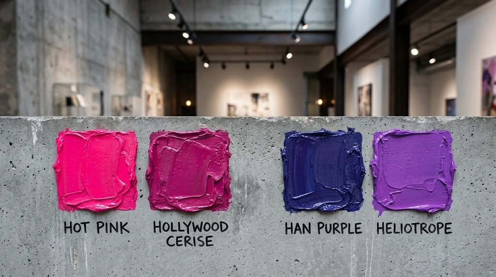
A few “H” pairs trip people up constantly. Hot Pink and Hollywood Cerise both read as bold, saturated pink at a glance, but Hollywood Cerise carries noticeably more magenta, pulling it closer to purple than Hot Pink ever gets. Hot Fuchsia sits close to both, distinguished mainly by a marginally cooler, more blue-leaning undertone.
Heliotrope and Han Purple can also cause confusion in the purple family, since both are vivid and saturated, but Han Purple runs deeper and more blue, while Heliotrope stays lighter and pinker. Han Blue and Honolulu Blue get mixed up occasionally too, despite one being an ancient pigment and the other a modern sports color, simply because both land in a similar mid-tone blue range.
The table below lines up the clearest pairs directly so the difference is easy to see at a glance. Pay attention to the RGB numbers, not just the names, since two colors can look nearly identical in a small swatch but read very differently once scaled up.
| Color A | Hex A | Color B | Hex B | Key Difference |
| Hot Pink | #FF69B4 | Hollywood Cerise | #F400A1 | Hollywood Cerise leans more magenta |
| Hot Fuchsia | #FF00C6 | Hollywood Cerise | #F400A1 | Hot Fuchsia is slightly cooler, bluer |
| Heliotrope | #DF73FF | Han Purple | #5218FA | Han Purple is deeper, more blue |
| Han Blue | #446CCF | Honolulu Blue | #006DB0 | Honolulu Blue is darker, less purple |
Hot Pink versus Hollywood Cerise is the pair most likely to confuse someone skimming a swatch chart quickly, since both are bold, saturated pinks with only a subtle shift toward magenta separating them. Han Blue versus Honolulu Blue matters more for historical accuracy than everyday design, since one carries two thousand years of pigment history and the other dates to a 20th-century sports franchise.
Master Alphabetical List of H Colors
This list includes standard CSS/X11 names, documented institutional colors, and long-established traditional pigment names. Standard CSS/X11 names are marked with an asterisk, since those carry a single, universally agreed hex code. Every other name below is still verified against its cited source, though minor variation can exist across informal color-naming sites.

- Han Blue — #446CCF
- Han Purple — #5218FA
- Hansa Yellow — #E9D66B
- Harlequin — #3FFF00
- Harvard Crimson — #C90016
- Harvest Gold — #DA9100
- Heat Wave — #FF7A00
- Heliotrope — #DF73FF
- Heliotrope Gray — #AA98A9
- Hollywood Cerise — #F400A1
- Honeydew* — #F0FFF0
- Honolulu Blue — #006DB0
- Hooker’s Green — #49796B
- Hot Fuchsia — #FF00C6
- Hot Pink* — #FF69B4
- Hunter Green — #355E3B
Notice how many of these entries trace back to a specific, documented origin, whether that’s an ancient pigment, a botanical illustrator, or a sports franchise. That pattern is more pronounced in the “H” family than in some other letters, likely because so few purely descriptive color words happen to start with H.
Hex/RGB Crosswalk: Why Exact Codes Matter
A color name alone isn’t enough for real design work. Two designers using “hot pink” without a hex code might still agree, since Hot Pink is a fixed CSS standard, but a name like “Heliotrope” can shift more noticeably between informal sources. That’s why any serious project needs the exact hex or RGB value locked in before production starts.
Hex codes matter most for web and app design, since browsers read hex values directly. RGB values matter more for video, screen graphics, and design software that calculates color mathematically. The table below gives both formats for five of the most frequently searched “H” colors, so you can copy whichever your tool requires.

| Color | Hex | RGB |
| Hot Pink | #FF69B4 | 255, 105, 180 |
| Heliotrope | #DF73FF | 223, 115, 255 |
| Harlequin | #3FFF00 | 63, 255, 0 |
| Harvard Crimson | #C90016 | 201, 0, 22 |
| Hunter Green | #355E3B | 53, 94, 59 |
Harlequin’s RGB values show a nearly maxed-out green channel paired with almost zero red and blue, which is exactly what gives it that electric, neon-like intensity. Harvard Crimson, by contrast, keeps its green and blue channels close to zero while pushing red only moderately high, producing a deep, formal red rather than anything bright or playful.
Full Comparison Table: All 16 H Colors
This table brings every color from the alphabetical list together with hex, RGB, color family, and common use. Use the family column to quickly find colors that will sit well together in a single palette, and use the common use column to match a color to your actual project type.
| Color | Hex | RGB | Family | Common Use |
| Han Blue | #446CCF | 68, 108, 207 | Blue | Historic pigment, art reference |
| Han Purple | #5218FA | 82, 24, 250 | Purple | Historic pigment, art reference |
| Hansa Yellow | #E9D66B | 233, 214, 107 | Yellow | Fine art pigment |
| Harlequin | #3FFF00 | 63, 255, 0 | Green | High-energy accent branding |
| Harvard Crimson | #C90016 | 201, 0, 22 | Red | University, institutional branding |
| Harvest Gold | #DA9100 | 218, 145, 0 | Gold/Orange | Retro interior branding |
| Heat Wave | #FF7A00 | 255, 122, 0 | Orange | Bold, energetic branding |
| Heliotrope | #DF73FF | 223, 115, 255 | Purple | Beauty, fragrance branding |
| Heliotrope Gray | #AA98A9 | 170, 152, 169 | Purple/Gray | Soft sophisticated accent |
| Hollywood Cerise | #F400A1 | 244, 0, 161 | Pink/Magenta | Glamour, entertainment branding |
| Honeydew | #F0FFF0 | 240, 255, 240 | Green/White | Pale background tone |
| Honolulu Blue | #006DB0 | 0, 109, 176 | Blue | Sports team branding |
| Hooker’s Green | #49796B | 73, 121, 107 | Green | Traditional art pigment |
| Hot Fuchsia | #FF00C6 | 255, 0, 198 | Pink/Magenta | Bold fashion accent |
| Hot Pink | #FF69B4 | 255, 105, 180 | Pink | Fashion, beauty branding |
| Hunter Green | #355E3B | 53, 94, 59 | Green | Outdoor, heritage branding |
A few rows deserve a second look. Han Blue and Han Purple stand out as the only two colors on this entire table tied to a documented pigment over two thousand years old. Harlequin holds the most extreme RGB values here, maxing out its green channel while keeping the others near zero. Harvard Crimson and Honolulu Blue both function as fixed institutional colors, meaning their hex codes are far less likely to shift or be reinterpreted compared to more descriptive names like Heat Wave.
Decision-Flow Table: Picking the Right “H” Color
Choosing between sixteen distinct names gets easier with a clear project goal in mind. The table below matches common use cases to a recommended “H” color, so you can skip the guesswork and go straight to a shade that fits the job.
| If you need… | Pick this color | Why |
| A bold fashion or beauty brand | Hot Pink or Hollywood Cerise | Confident, unmistakable, high-energy |
| An outdoor or heritage brand | Hunter Green | Grounded, trustworthy, natural |
| A high-visibility accent color | Harlequin or Heat Wave | Impossible to miss |
| A historic or scholarly design project | Han Blue or Han Purple | Rooted in genuine ancient pigment history |
| A soft, romantic beauty palette | Heliotrope | Cool, floral, gentle intensity |
| A university or institutional identity | Harvard Crimson | Formal, established, trustworthy |
| A pale, minimal background tone | Honeydew | Soft, barely-there green |
Use this table as a starting point rather than a final answer. A brand built entirely around Hot Pink, for instance, often benefits from a neutral like Honeydew alongside it to keep the palette from feeling overwhelming. Pair the recommended color with a calmer neutral from the comparison table above for a balanced result.
Conclusion
Colors that start with H run smaller than most letters, but the range still stretches from the electric intensity of Harlequin to the ancient depth of Han Purple. This list sticks to 16 verified names with real hex and RGB codes, so nothing here is guesswork or padding. Whether you’re building a brand, exploring color history, or just curious, these colors that start with H give you a solid, checkable starting point.
Frequently Asked Questions
How many colors actually start with the letter H?
This guide covers 16 verified colors with confirmed hex and RGB codes, drawn from CSS/X11 standards, documented institutional colors, and long-established pigment names. One commonly cited name, Hot Magenta, was excluded after two sources gave conflicting hex codes.
What are some common colors that start with H?
Hot Pink, Heliotrope, Harlequin, Hunter Green, and Harvard Crimson are among the most recognized. Each has a documented hex code and shows up regularly in design, fashion, and branding.
Is Hot Pink a real CSS color?
Yes. Hot Pink is a standard CSS/X11 color with the hex code #FF69B4, one of only two colors on this list with official CSS status.
What’s the difference between Han Blue and Han Purple?
Han Blue (#446CCF) and Han Purple (#5218FA) are companion pigments first synthesized in ancient China. Han Purple carries noticeably more red and blue, giving it a deeper, more saturated purple compared to Han Blue’s mid-tone blue.
Where does the color Heliotrope come from?
Heliotrope takes its name and tone from the heliotrope flower, first recorded as a color name in English in 1882. Victorian mourning fashion later adopted it during the lighter, final stage of grief.
What color is Harlequin exactly?
Harlequin is an extremely bright, electric green with the hex code #3FFF00, named after the diamond-patterned costume character rather than anything found in nature.
Is Hunter Green tied to actual hunting?
Yes, historically. Hunter Green, hex #355E3B, is associated with hunting apparel designed to blend into deep woodland, which is part of why it reads as muted and grounded rather than bright.