
Colors That Start With W: Popular, Rare & Unique Shades

Colors that start with W cover more ground than the letter’s small size might suggest. White sits at one end, the most universal color in existence. Wisteria and Wine Dregs sit at the other, tied to a flower and a genuinely poetic bit of wine-tasting language.
This list of colors that start with W only includes names with a real, checkable source. That means official CSS/X11 standards, Crayola’s official naming, and traditional color names cross-checked against at least two independent sources. Every hex code here was verified this way before it made the list.
That checking mattered a lot for this letter. Some sites claim 1,150 or more colors that start with W. Most of those names, things like “Weeping Wisteria” or “What Inheritance,” came from a single fan-made source with no second reference to confirm the hex code. Even a common name like “Watermelon Red” showed three different hex codes across three different sites. Fourteen colors that start with W survived real cross-checking, and every one is backed by a source you can verify yourself.
Quick Answer: Standout W Colors
Short on time? Here are eight standout colors that start with W. White (#FFFFFF) is the most universal color in existence, pure and complete. Wheat (#F5DEB3) offers a warm, soft tan pulled directly from the grain. Wisteria (#C9A0DC) delivers a soft purple named after the cascading flower.
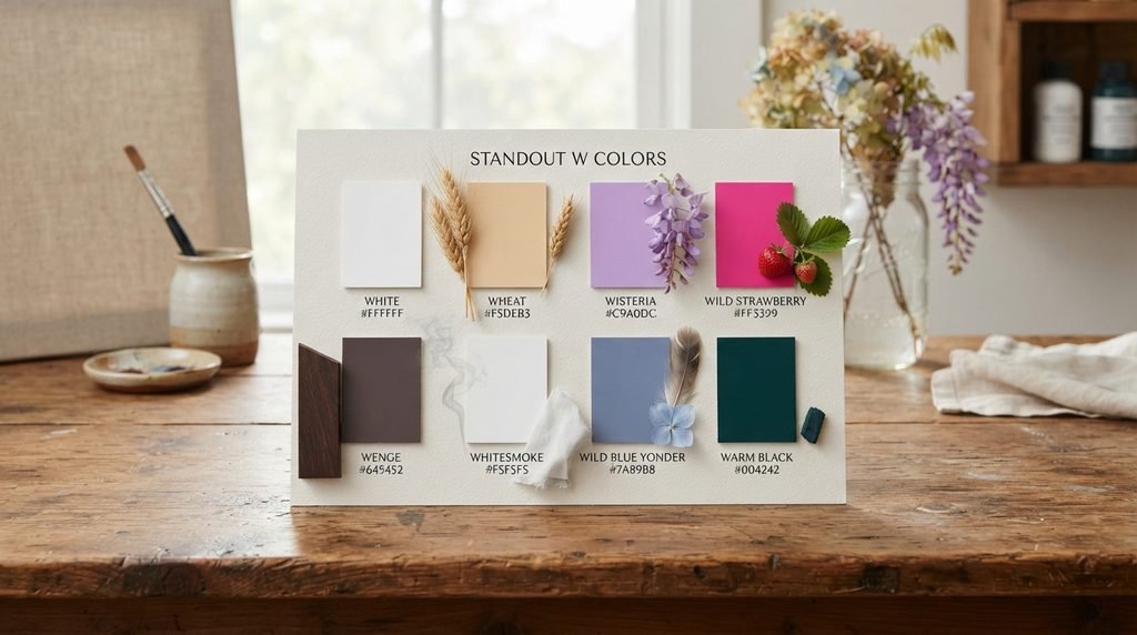
Wild Strawberry (#FF3399) provides a bold, saturated pink from the Crayola lineup. Wenge (#645452) gives a deep, rich brown named after the African hardwood. WhiteSmoke (#F5F5F5) rounds out the neutral end with a soft, barely-there gray. Wild Blue Yonder (#7A89B8) offers a muted, dreamy blue. Warm Black (#004242) finishes the list with a deep, teal-tinted near-black. Each of these colors that start with W earns its spot through genuine, documented use.
What W Colors Mean and Evoke
Color names carry emotional weight, and colors that start with W often lean toward comfort and softness. White suggests purity and simplicity, the most universally understood color across nearly every culture on Earth. Wheat carries a similar warmth, evoking harvest, home, and quiet abundance rather than anything bold or dramatic.
Wisteria suggests gentle romance, tied directly to the flower’s soft, cascading blooms that appear each spring. Wild Strawberry breaks from that softness entirely, built for energy and playfulness rather than calm. WhiteSmoke sits somewhere in between, quiet and understated without the starkness of pure white.
Wine Dregs and Warm Black both lean toward depth and reflection. Wine Dregs borrows its poetic name from the sediment left at the bottom of a wine bottle, suggesting richness earned through time rather than anything fresh or new. Warm Black carries a similar quiet intensity, deep enough to function as a near-black while still holding a subtle undertone that pure black lacks.
Color Families: Where W Colors Belong
Neutrals and Whites
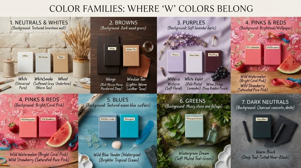
White, WhiteSmoke, and Wheat anchor this family among colors that start with W. White stays the most universal, while WhiteSmoke softens things slightly into a barely-there gray. Wheat carries the most warmth of the three, closer to a soft tan than a true neutral.
Browns
Wenge and Windsor Tan cover this family. Wenge runs deep and rich, named directly after the African hardwood prized in furniture making. Windsor Tan stays lighter and warmer, closer to a traditional leather tone.
Purples
Wisteria, White Violet, and Wine Dregs make up this family among colors that start with W. Wisteria stays soft and floral, while White Violet pales even further, closer to a pastel lavender. Wine Dregs runs the deepest of the three, pulling more red into the mix.
Pinks and Reds
Wild Watermelon and Wild Strawberry anchor this bold, energetic family. Both run bright and saturated, built for attention rather than subtlety, though Wild Strawberry pushes slightly more toward pure pink while Wild Watermelon carries a touch more coral.
Blues
Wild Blue Yonder and Waterspout cover this family. Wild Blue Yonder stays muted and dreamy, while Waterspout runs far brighter and more tropical, closer to a clear, shallow ocean than a hazy sky.
Greens
Wintergreen Dream stands alone in this family, a soft, muted teal-green that leans calming rather than vibrant.
Dark Neutrals
Warm Black stands alone in this family, a deep, teal-tinted near-black distinct from anything purely gray or brown.
Design & Branding Favorites
Certain colors that start with W show up constantly in real branding work. White remains the single most-used background color across nearly every industry, valued for its clarity and universal readability. Wenge appears often in furniture and interior branding, borrowed directly from the wood it’s named after. Wild Strawberry gets used in youthful, energetic branding where a bold pink demands attention.
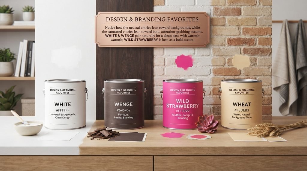
Below is a quick reference for how four colors that start with W typically get used in real design work. Notice how the neutral entries lean toward backgrounds and readability, while the saturated entries lean toward bold, attention-grabbing accents.
| Color | Hex | Typical Use |
| White | #FFFFFF | Universal backgrounds, clean design |
| Wenge | #645452 | Furniture, interior branding |
| Wild Strawberry | #FF3399 | Youthful, energetic branding |
| Wheat | #F5DEB3 | Warm, natural background tone |
White and Wenge pair naturally together, since one provides a clean base and the other adds warmth and depth. Wild Strawberry works best as a bold accent, rarely used as a dominant background color given its intensity.
Fashion & Beauty Shades
Fashion draws on several colors that start with W reliably. Wisteria remains a steady presence in spring and bridal collections, valued for reading as soft and romantic without tipping into anything too sweet. White, of course, dominates bridal fashion entirely, the default choice for wedding gowns across most Western traditions.
Wild Strawberry deserves a mention here too, since its bold, saturated pink shows up constantly in youth-focused fashion and cosmetics lines specifically because it refuses to blend in. Its intensity sets it apart from a softer entry like White Violet, which almost never appears in the same bold product category.
Nature-Inspired Names
Several colors that start with W borrow directly from the natural world. Wheat takes its name and warm tan color from the grain itself, one of the more literal nature-to-color connections in this letter group. Wisteria pulls from the flower, capturing its soft, cascading purple almost exactly.
Wenge closes out this group with a genuine material connection, named after a dense African hardwood used in furniture and flooring. Wild Watermelon and Wild Strawberry both reference fruit, though their names carry more energy than accuracy, since both run considerably bolder than the actual fruits they’re named after.
Rare or Unusual W Colors
Some colors that start with W rarely surface outside specialist circles, but each has a real story behind it. Wine Dregs earns its unusual name from wine tasting language, describing the sediment that settles at the bottom of a bottle after aging, a deep, muddied red-purple distinct from the wine itself. Windsor Tan carries a quieter, more traditional origin, tied to leather and upholstery naming conventions rather than anything botanical or artistic.
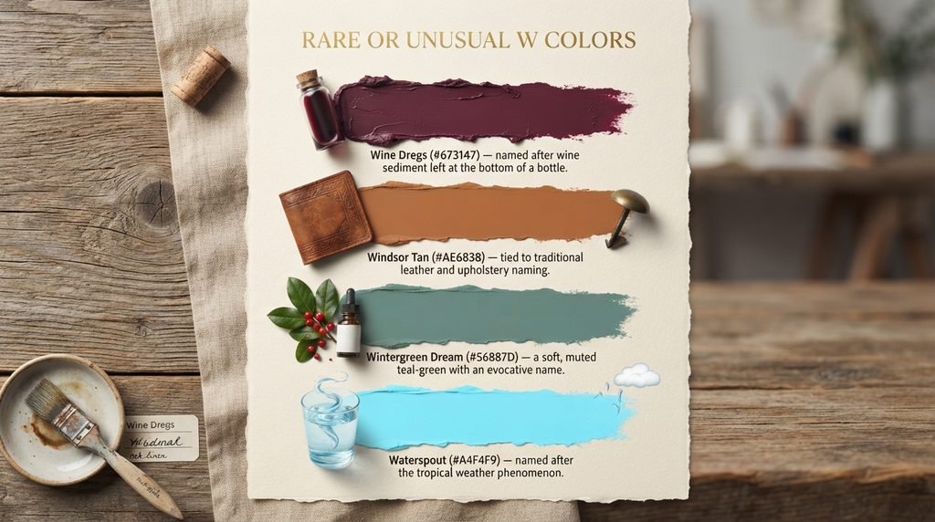
Wintergreen Dream stands out for its evocative, almost poetic name, describing a soft, muted teal-green that suggests calm rather than anything sharp or medicinal despite the wintergreen reference. Waterspout rounds out this group with a genuinely playful origin, named after the tropical weather phenomenon rather than anything calmer or more literal. Each of these colors that start with W shows that “obscure” usually means “specifically named,” not invented.
- Wine Dregs (#673147) — named after wine sediment left at the bottom of a bottle
- Windsor Tan (#AE6838) — tied to traditional leather and upholstery naming
- Wintergreen Dream (#56887D) — a soft, muted teal-green with an evocative name
- Waterspout (#A4F4F9) — named after the tropical weather phenomenon
These four sit at the edge of common knowledge, but each one has a stable, checkable source. That’s what separates a genuinely rare color name from a vague one that different sites define inconsistently.
Colors Easily Confused With Each Other
A few pairs among colors that start with W trip people up constantly. Wild Watermelon and Wild Strawberry both read as bright, saturated pink at a glance, but Wild Watermelon carries noticeably more coral, while Wild Strawberry stays closer to a pure, hot pink. White and WhiteSmoke also cause confusion, since both look nearly identical on a screen, but WhiteSmoke carries just enough gray to soften harsh contrast in design work.
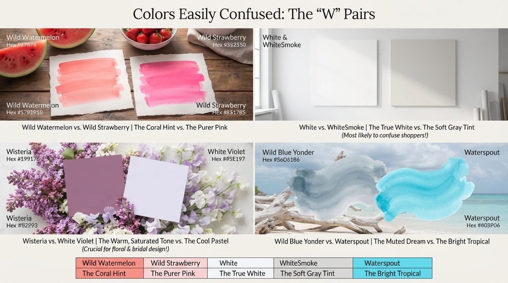
Wisteria and White Violet can also blur together, since both are pale purples, but White Violet runs considerably lighter and cooler, closer to a true pastel than Wisteria’s warmer, more saturated tone. Wild Blue Yonder and Waterspout sit in the same general blue family but read very differently, one muted and dreamy, the other bright and tropical.
The table below lines up the clearest pairs directly so the difference is easy to see at a glance. Pay attention to the RGB numbers, not just the names, since two colors that start with W can look nearly identical in a small swatch but read differently once scaled up.
| Color A | Hex A | Color B | Hex B | Key Difference |
| Wild Watermelon | #FC6C85 | Wild Strawberry | #FF3399 | Wild Strawberry is a purer pink |
| White | #FFFFFF | WhiteSmoke | #F5F5F5 | WhiteSmoke carries a soft gray tint |
| Wisteria | #C9A0DC | White Violet | #E5E1FF | White Violet is far paler, cooler |
| Wild Blue Yonder | #7A89B8 | Waterspout | #A4F4F9 | Waterspout is far brighter, more tropical |
White versus WhiteSmoke is the pair most likely to confuse someone shopping for design assets, since both look nearly identical until placed directly against a true white background. Wisteria versus White Violet matters most for anyone doing floral or bridal design work, since choosing the wrong one can shift a look from warm and romantic to cool and pastel.
Master Alphabetical List of W Colors
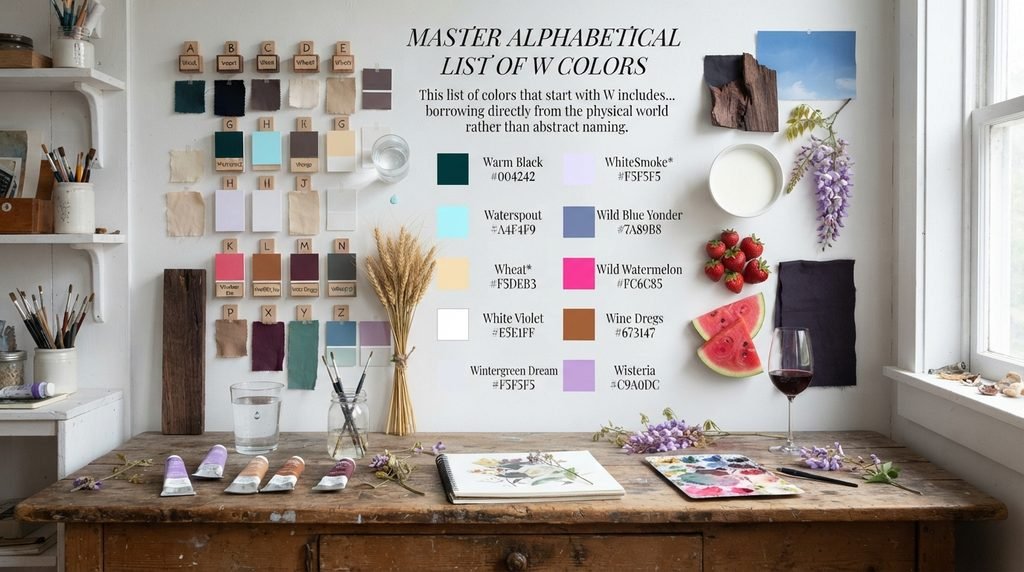
This list of colors that start with W includes official CSS/X11 standards, Crayola-official names, and traditional color names cross-checked against independent sources. Standard CSS/X11 names are marked with an asterisk, since those carry a single, universally agreed hex code. Every other name below is still verified against its cited source.
- Warm Black — #004242
- Waterspout — #A4F4F9
- Wenge — #645452
- Wheat* — #F5DEB3
- White* — #FFFFFF
- White Violet — #E5E1FF
- WhiteSmoke* — #F5F5F5
- Wild Blue Yonder — #7A89B8
- Wild Strawberry — #FF3399
- Wild Watermelon — #FC6C85
- Windsor Tan — #AE6838
- Wine Dregs — #673147
- Wintergreen Dream — #56887D
- Wisteria — #C9A0DC
Notice how many of these colors that start with W trace back to a specific material, food, or weather phenomenon, from wenge wood to watermelon fruit. That pattern shows how naturally descriptive this letter group tends to be, borrowing directly from the physical world rather than abstract naming.
Hex/RGB Crosswalk: Why Exact Codes Matter
A color name alone isn’t enough for real design work, even among colors that start with W. Two designers using “white” without a hex code might still agree, since White is a fixed CSS standard, but a name like “Wisteria” can shift more noticeably between informal sources. That’s why any serious project needs the exact hex or RGB value locked in before production starts.
Hex codes matter most for web and app design, since browsers read hex values directly. RGB values matter more for video, screen graphics, and design software that calculates color mathematically. The table below gives both formats for five of the most frequently searched colors that start with W, so you can copy whichever your tool requires.
| Color | Hex | RGB |
| White | #FFFFFF | 255, 255, 255 |
| Wheat | #F5DEB3 | 245, 222, 179 |
| Wisteria | #C9A0DC | 201, 160, 220 |
| Wenge | #645452 | 100, 84, 82 |
| Wild Strawberry | #FF3399 | 255, 51, 153 |
White’s RGB values max out all three channels equally, which is exactly what produces its pure, complete brightness. Wenge, by contrast, keeps all three channels low and close together, giving it that flat, earthy depth instead of anything bright or saturated.
Full Comparison Table: All 14 W Colors
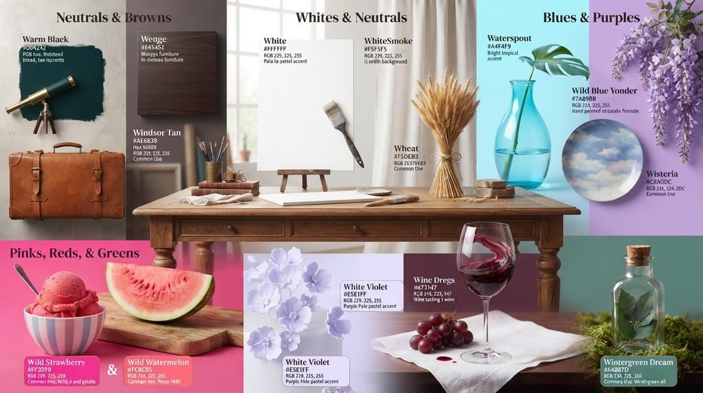
This table brings every color that starts with W together with hex, RGB, color family, and common use. Use the family column to quickly find colors that will sit well together in a single palette, and use the common use column to match a color that starts with W to your actual project type.
| Color | Hex | RGB | Family | Common Use |
| Warm Black | #004242 | 0, 66, 66 | Neutral | Broad, teal-tinted near-black accent |
| Waterspout | #A4F4F9 | 164, 244, 249 | Blue | Bright tropical accent |
| Wenge | #645452 | 100, 84, 82 | Brown | Furniture, interior branding |
| Wheat | #F5DEB3 | 245, 222, 179 | Neutral/Brown | Warm natural background |
| White | #FFFFFF | 255, 255, 255 | Neutral | Universal background, clean design |
| White Violet | #E5E1FF | 229, 225, 255 | Purple | Pale pastel accent |
| WhiteSmoke | #F5F5F5 | 245, 245, 245 | Neutral | Soft, gentle background |
| Wild Blue Yonder | #7A89B8 | 122, 137, 184 | Blue | Muted, dreamy accent |
| Wild Strawberry | #FF3399 | 255, 51, 153 | Pink | Youthful, energetic branding |
| Wild Watermelon | #FC6C85 | 252, 108, 133 | Pink/Coral | Bright playful accent |
| Windsor Tan | #AE6838 | 174, 104, 56 | Brown | Leather, traditional accent |
| Wine Dregs | #673147 | 103, 49, 71 | Purple/Red | Deep sophisticated accent |
| Wintergreen Dream | #56887D | 86, 136, 125 | Green | Calm, muted accent |
| Wisteria | #C9A0DC | 201, 160, 220 | Purple | Romantic, floral branding |
A few rows deserve a second look. White holds the most extreme RGB values on this entire table, maxing out every channel at once. Wine Dregs stands out as the only entry with a genuinely poetic origin tied to wine tasting rather than nature, material, or fashion. Wild Watermelon and Wild Strawberry together prove how much two closely related pink names can still differ once their exact RGB values are compared side by side.
Decision-Flow Table: Picking the Right W Color
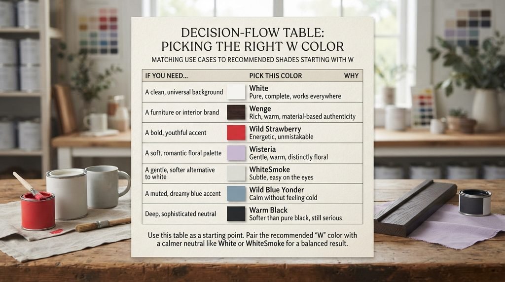
Choosing between fourteen distinct names gets easier with a clear project goal in mind. The table below matches common use cases to a recommended color that starts with W, so you can skip the guesswork and go straight to a shade that fits the job.
| If you need… | Pick this color | Why |
| A clean, universal background | White | Pure, complete, works everywhere |
| A furniture or interior brand | Wenge | Rich, warm, material-based authenticity |
| A bold, youthful accent | Wild Strawberry | Energetic, unmistakable |
| A soft, romantic floral palette | Wisteria | Gentle, warm, distinctly floral |
| A gentle, softer alternative to white | WhiteSmoke | Subtle, easy on the eyes |
| A muted, dreamy blue accent | Wild Blue Yonder | Calm without feeling cold |
| A deep, sophisticated neutral | Warm Black | Softer than pure black, still serious |
Use this table as a starting point rather than a final answer. A palette built entirely around Wild Strawberry, for instance, often benefits from a neutral like White or WhiteSmoke alongside it to balance its intensity. Pair the recommended color that starts with W with a calmer neutral from the comparison table above for a balanced result.
Conclusion
Colors that start with W stretch from the universal simplicity of White to the poetic depth of Wine Dregs. This list sticks to 14 verified names with real hex and RGB codes, so nothing here is guesswork or padding. Whether you’re building a brand, decorating a space, or just curious, these colors that start with W give you a solid, checkable starting point.
Frequently Asked Questions
How many colors actually start with the letter W?
This guide covers 14 verified colors that start with W, each cross-checked against at least two independent sources. Larger lists claiming 1,150 or more usually rely on single-source, fan-made names with no second reference to confirm the hex code.
What are the most well-known colors that start with W?
White, Wheat, Wisteria, Wenge, and Wild Strawberry are among the most recognized colors that start with W. Each has a documented hex code confirmed across multiple sources.
Is White a real CSS color?
Yes. White is a standard CSS/X11 color with the hex code #FFFFFF, one of the most universally used named colors in web and app design.
What’s the difference between White and WhiteSmoke? White, hex #FFFFFF, is pure and maxes out every color channel, while WhiteSmoke, hex #F5F5F5, carries a very slight gray tint, making it softer for backgrounds and large surfaces.
What color is Wenge exactly? Wenge is a deep, rich brown with the hex code #645452, named directly after the dense African hardwood prized in furniture and flooring.
Why was Watermelon Red excluded from this list? Different sources cited three separate hex codes for Watermelon Red, with no clear way to determine which was accurate. Rather than guess, this guide left it out entirely.
Is Wisteria named after the flower? Yes. Wisteria, hex #C9A0DC, takes its name and soft purple tone directly from the cascading flowering vine of the same name.
What’s the difference between Wild Watermelon and Wild Strawberry? Wild Watermelon, hex #FC6C85, carries more coral and orange undertones, while Wild Strawberry, hex #FF3399, stays closer to a pure, saturated pink.
What does Wine Dregs refer to as a color name? Wine Dregs, hex #673147, describes the sediment that settles at the bottom of a wine bottle after aging, a deep, muddied red-purple distinct from the wine itself.
Is Windsor Tan a traditional color name? Yes. Windsor Tan, hex #AE6838, ties to traditional leather and upholstery naming conventions, reading as warmer and lighter than most other browns in this letter group.
What is Warm Black used for?
Warm Black, hex #004242, is a deep, teal-tinted near-black often used as a sophisticated alternative to pure black in design that needs subtle depth rather than flat darkness.