
Colors That Start With T: Beautiful (With Pictures & Names)

The letter T covers unusual ground. It holds warm earth tones. It also holds sharp, modern blues and greens. This guide gathers the many colors that start with T, from the soft neutral Tan to the deep, historic Tyrian Purple. It exists to solve one simple problem. Scattered, inconsistent color lists slow down real design work.
The article moves in stages. It opens with the most familiar T colors. Then it groups shades by family. After that, it covers real use cases like branding and fashion. It ends with a full alphabetical reference, including hex and RGB codes for fast lookup.
Different readers need this list for different reasons. Designers need exact codes that render the same everywhere. Painters want names that spark ideas rather than numbers. Parents naming a pet, a nursery, or a paint swatch often just want something pleasant. Trivia fans enjoy learning that a name like “Tyrian Purple” comes from an actual ancient dye.
Every entry here is checked against real sources. This includes the official CSS/X11 web color specification. It also includes long-standing, well-documented color-name databases. Where a name is traditional rather than official, that distinction is stated plainly.
Quick Answer: The Standout T Colors at a Glance
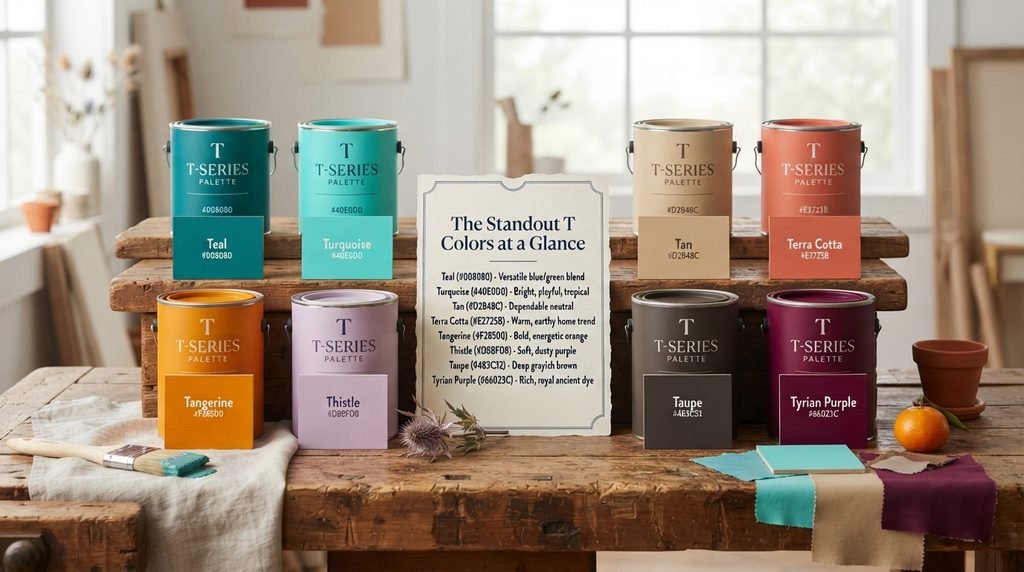
A few T colors matter more than the rest. Teal (#008080) leads the list, since it blends blue and green into one of the most versatile shades in modern design. Turquoise (#40E0D0) sits close by, brighter and more playful than Teal, and is instantly tied to tropical water. Tan (#D2B48C) earns its spot as one of the most dependable neutrals in fashion and interior design. Terra Cotta (#E2725B) has surged in popularity recently, driven by a strong trend toward warm, earthy home décor. Tangerine (#F28500) brings pure energy, standing as one of the boldest orange shades in any palette. Thistle (#D8BFD8) and Taupe (#483C32) round out the list from opposite ends, one a soft, dusty purple, the other a deep grayish brown. Tyrian Purple (#66023C) closes the group with the richest backstory of all, tracing back to an ancient dye so expensive that only royalty could once afford it.
What T Colors Tend to Symbolize
T colors split cleanly into two emotional camps. One camp runs warm and grounded. The other runs cool and calm. Tan, Terra Cotta, and Tangerine belong to the warm camp. These shades feel earthy, energetic, and approachable, which is exactly why they dominate autumn palettes and cozy interior design.
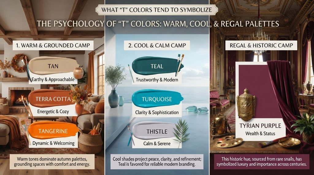
Teal, Turquoise, and Thistle sit in the cooler camp. These shades project calm, clarity, and a touch of sophistication. Teal in particular has built a strong reputation in modern branding, since it reads as trustworthy without feeling as corporate as plain blue.
Tyrian Purple stands apart from both camps entirely. This deep, reddish purple carries centuries of symbolic weight tied to wealth and status. The original dye came from a rare sea snail, and producing even a small amount required enormous labor. That history still echoes today, since purple in general continues to signal luxury and importance across many cultures.
T Colors Grouped by Family
Splitting T colors into families makes the whole list far easier to use. A person hunting for a calm bathroom color and a person hunting for a bold accent wall need very different starting points.

The blues and greens form the strongest T family, anchored by Teal, Turquoise, and Tropical Rain Forest. These shades share a cool, refreshing quality, though Teal leans darker and more formal while Turquoise stays brighter and more playful.
The browns and neutrals cluster around Tan, Taupe, Timberwolf, and Toffee. This group carries a soft, dependable feeling, and it shows up constantly as a background or pairing color rather than a standalone statement shade.
The oranges and warm reds include Tangerine, Terra Cotta, Tenné, and Tomato. Most of these shades feel energetic and grounded at the same time, which explains their popularity in both food branding and autumn-themed design.
The purples and pinks round out the list, led by Thistle, Tyrian Purple, and Tickle Me Pink. This family stretches from soft and delicate to deep and historic, showing just how wide the letter T actually reaches.
T Colors in Design and Branding
Certain T colors show up constantly in logos and product design, and the reasons are worth unpacking. Teal remains one of the most requested “calm but modern” colors in tech and wellness branding, since it avoids the coldness of plain blue while still feeling professional. Turquoise plays a similar role in travel and hospitality branding, where its bright, tropical feel signals relaxation immediately.
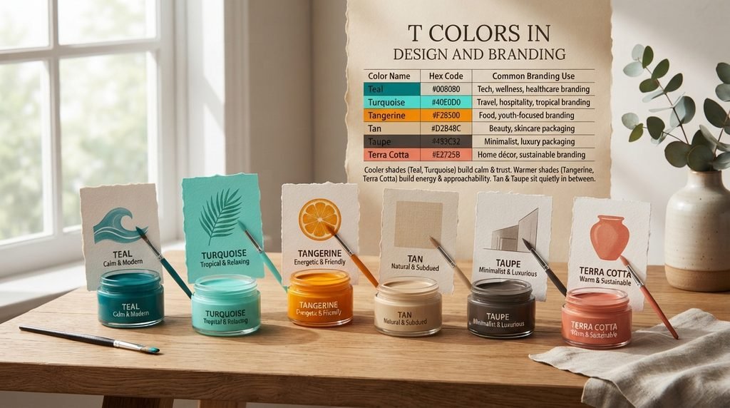
Tangerine has become a favorite for brands chasing energy without the aggression of pure red. Its warmth reads as friendly rather than urgent, which makes it common in youth-focused and food-service branding. Tan and Taupe, meanwhile, do quieter work as background and packaging colors, especially in beauty and skincare branding where a soft, neutral base matters more than a bold statement.
| Color Name | Hex Code | Common Branding Use |
| Teal | #008080 | Tech, wellness, healthcare branding |
| Turquoise | #40E0D0 | Travel, hospitality, tropical branding |
| Tangerine | #F28500 | Food, youth-focused branding |
| Tan | #D2B48C | Beauty, skincare packaging |
| Taupe | #483C32 | Minimalist, luxury packaging |
| Terra Cotta | #E2725B | Home décor, sustainable branding |
This table shows a clear split. Cooler shades like Teal and Turquoise build a sense of calm and trust. Warmer shades like Tangerine and Terra Cotta build energy and approachability. Tan and Taupe sit quietly in between, chosen more for restraint than impact.
T Colors in Fashion and Beauty
Fashion and beauty brands lean on T colors heavily, especially from the pink and neutral families. Tickle Me Pink has become a genuine pop-culture favorite, thanks largely to its playful name as much as its soft, vivid pink tone. Taupe continues to dominate neutral makeup palettes, since it pairs easily with nearly any skin tone without pulling too warm or too cool.

Terra Cotta has crossed over from interior design into beauty products too, particularly in bronzers and blushes that want to suggest sun-warmed skin. Turquoise, meanwhile, remains a jewelry staple, tracing back to the actual turquoise gemstone that has been used in adornment for thousands of years across multiple cultures.
Rare and Unusual T Color Names
A few T color names carry stories worth pausing on. Tyrian Purple is the standout here, named after the ancient Phoenician city of Tyre, where the dye was first produced from the mucus of a specific sea snail. Producing enough dye to color a single garment required thousands of snails, which is exactly why the resulting deep reddish-purple became a symbol of imperial wealth.
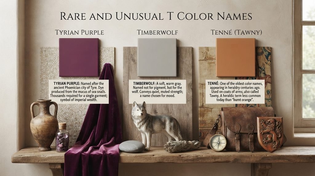
Timberwolf, a soft, warm gray, takes its name from the wolf species rather than any pigment or plant. The color itself has little obvious connection to the animal beyond a shared sense of quiet, muted strength, making it a good example of a name chosen for mood rather than direct visual reference. Tenné, sometimes called Tawny, is one of the oldest color names on this list, appearing in heraldry centuries ago as a muted orange-brown used on coats of arms. Its rarity today comes largely from how few people still use its archaic heraldic name instead of simpler alternatives like “burnt orange.”
Colors That Are Easy to Confuse With Each Other
A handful of T colors sit close enough together that mixing them up is genuinely easy. Teal (#008080) and Turquoise (#40E0D0) are the most common mix-up, since both blend blue and green. Teal is darker and more muted, while Turquoise is brighter and leans closer to true cyan.
Tan (#D2B48C) and Taupe (#483C32) also cause confusion despite looking quite different side by side, mostly because both names get used loosely in casual conversation. Tan is a light, warm beige, while Taupe is a much darker, grayish brown. Terra Cotta (#E2725B) and Tenné (#CD5700) blur together too, both reading as warm, earthy orange-browns; Terra Cotta leans pinker and softer, while Tenné sits more saturated and closer to true orange. Checking the exact hex code before finalizing a palette avoids all of these near-miss mistakes.
Master Alphabetical List of T Colors
This reference gathers every color covered in this guide into one alphabetical list. It mixes standardized CSS/X11 web colors with well-documented traditional names, noting which category each one belongs to.
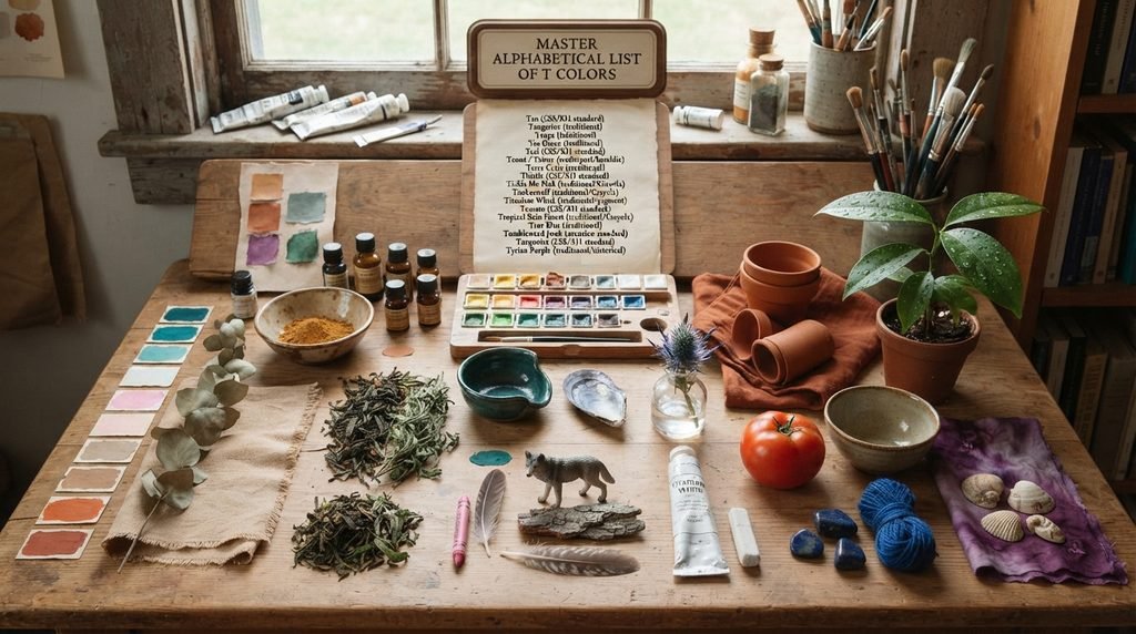
- Tan (CSS/X11 standard)
- Tangerine (traditional)
- Taupe (traditional)
- Tea Green (traditional)
- Teal (CSS/X11 standard)
- Tenné / Tawny (traditional/heraldic)
- Terra Cotta (traditional)
- Thistle (CSS/X11 standard)
- Tickle Me Pink (traditional/Crayola)
- Timberwolf (traditional/Crayola)
- Titanium White (traditional/pigment)
- Tomato (CSS/X11 standard)
- Tropical Rain Forest (traditional/Crayola)
- True Blue (traditional)
- Tumbleweed (web extension standard)
- Turquoise (CSS/X11 standard)
- Tyrian Purple (traditional/historical)
This mix shows something useful. About half of the most common T names will render correctly in raw CSS code without any extra work. The rest need an explicit hex value attached, since they come from traditional or commercial naming rather than the official web standard.
Hex and RGB Crosswalk: Why Exact Codes Matter
A color name alone rarely provides enough precision for real design work. Names shift meaning depending on the source, the software, and even the printer being used. A hex code solves this by pointing to one fixed, unambiguous value. This matters especially for T colors, since several names in this group sound similar but represent noticeably different shades.
The table below pairs the most useful T colors with both hex and RGB values, making it simple to move between web development and print or paint work.
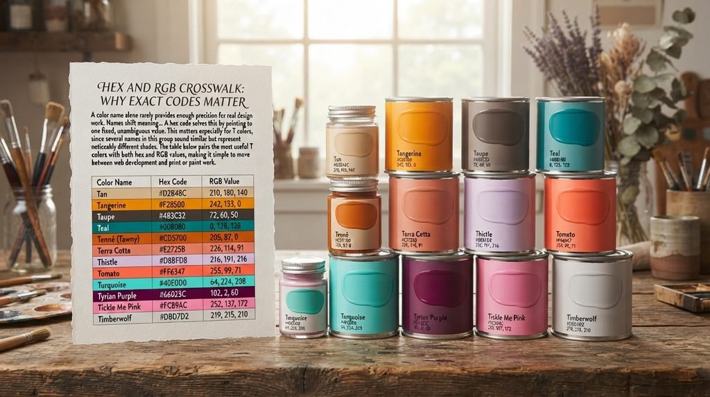
| Color Name | Hex Code | RGB Value |
| Tan | #D2B48C | 210, 180, 140 |
| Tangerine | #F28500 | 242, 133, 0 |
| Taupe | #483C32 | 72, 60, 50 |
| Teal | #008080 | 0, 128, 128 |
| Tenné (Tawny) | #CD5700 | 205, 87, 0 |
| Terra Cotta | #E2725B | 226, 114, 91 |
| Thistle | #D8BFD8 | 216, 191, 216 |
| Tomato | #FF6347 | 255, 99, 71 |
| Turquoise | #40E0D0 | 64, 224, 208 |
| Tyrian Purple | #66023C | 102, 2, 60 |
| Tickle Me Pink | #FC89AC | 252, 137, 172 |
| Timberwolf | #DBD7D2 | 219, 215, 210 |
Looking closely at these values confirms what the eye suspects. Teal and Turquoise share a green-blue base, but Turquoise carries far higher brightness across all three channels. Tyrian Purple, by contrast, shows a low green value against a high red and moderate blue, which is exactly why it reads as deep and slightly reddish rather than a clean, cool purple.
Full Comparison Table of T Colors
This expanded table brings together every color discussed in this guide, organized by name, hex code, RGB value, general family, and common use. Scanning the family column makes it easy to find a specific mood quickly.
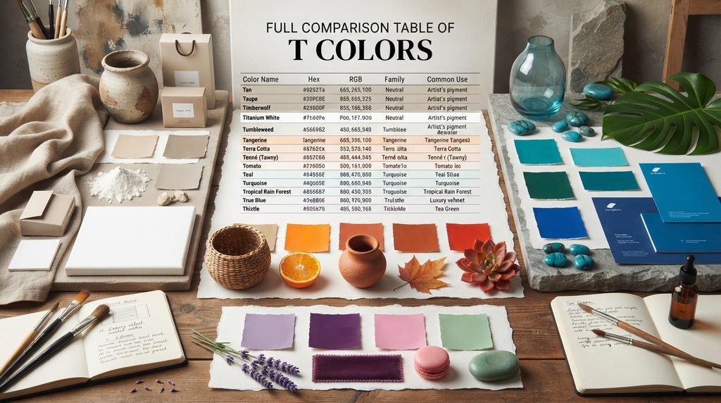
| Color Name | Hex | RGB | Family | Common Use |
| Tan | #D2B48C | 210,180,140 | Brown/Neutral | Fashion, packaging |
| Taupe | #483C32 | 72,60,50 | Dark Brown/Gray | Minimalist branding |
| Timberwolf | #DBD7D2 | 219,215,210 | Neutral Gray | Backgrounds, print design |
| Titanium White | #FFFFFF | 255,255,255 | White/Neutral | Art, base pigment |
| Tumbleweed | #DEAA88 | 222,170,136 | Warm Tan | Desert, rustic themes |
| Tangerine | #F28500 | 242,133,0 | Orange | Food, youth branding |
| Terra Cotta | #E2725B | 226,114,91 | Orange-Brown | Home décor, ceramics |
| Tenné (Tawny) | #CD5700 | 205,87,0 | Orange-Brown | Heraldry, autumn palettes |
| Tomato | #FF6347 | 255,99,71 | Red-Orange | Food branding, alerts |
| Teal | #008080 | 0,128,128 | Blue-Green | Tech, healthcare |
| Turquoise | #40E0D0 | 64,224,208 | Blue-Green | Travel, tropical branding |
| Tropical Rain Forest | #00755E | 0,117,94 | Deep Green | Eco branding, nature themes |
| True Blue | #0073CF | 0,115,207 | Blue | Corporate, trust-based branding |
| Thistle | #D8BFD8 | 216,191,216 | Soft Purple | Feminine, delicate design |
| Tyrian Purple | #66023C | 102,2,60 | Deep Purple | Luxury, historical branding |
| Tickle Me Pink | #FC89AC | 252,137,172 | Pink | Playful, youth branding |
| Tea Green | #D0F0C0 | 208,240,192 | Pale Green | Spa, calm interiors |
A few rows stand out from this table right away. Titanium White, sitting at pure #FFFFFF, is a reminder that not every named color needs a complex formula behind it. Tyrian Purple’s low RGB numbers across the board explain why it reads as so much darker and richer than a typical purple. Tropical Rain Forest, despite its dramatic name, turns out to be a fairly restrained, deep green rather than anything bright or flashy.
Decision Table: Picking the Right T Color for the Job
Matching a color name to an actual project is where the real decision-making happens. The table below organizes dependable T colors by use case, so a reader can jump straight to their specific need.
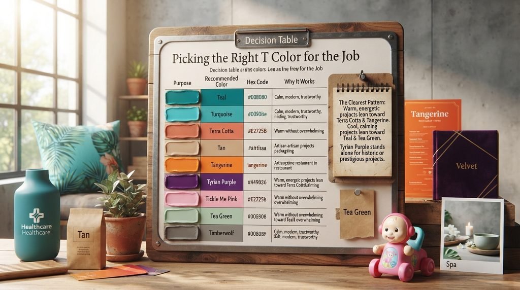
| Purpose | Recommended Color | Hex Code | Why It Works |
| Tech or healthcare logo | Teal | #008080 | Calm, modern, trustworthy |
| Travel or hospitality branding | Turquoise | #40E0D0 | Bright, tropical, welcoming |
| Living room accent wall | Terra Cotta | #E2725B | Warm without overwhelming |
| Neutral packaging design | Tan | #D2B48C | Soft, versatile, easy to pair |
| Food or restaurant branding | Tangerine | #F28500 | Energetic, appetite-friendly |
| Luxury or heritage branding | Tyrian Purple | #66023C | Historic, high-status feel |
| Children’s or playful branding | Tickle Me Pink | #FC89AC | Fun, approachable, bright |
| Spa or wellness interiors | Tea Green | #D0F0C0 | Calm, fresh, natural |
| Minimalist background | Timberwolf | #DBD7D2 | Soft, unobtrusive gray |
The clearest pattern in this table splits, once again, along temperature lines. Warm, energetic projects lean toward Terra Cotta and Tangerine. Cool, calming projects lean toward Teal and Tea Green. Tyrian Purple stands alone as the choice whenever a project needs to feel historic or prestigious rather than simply pleasant.
Conclusion
The letter T holds a genuinely wide color collection, stretching from the calm depth of Teal to the ancient richness of Tyrian Purple. It covers warm earth tones like Terra Cotta and Tan just as easily as cool, modern shades like Turquoise and True Blue. Anyone searching for colors that start with T has real variety to work with here, backed by verified hex and RGB data rather than guesswork.
Frequently Asked Questions
How many colors start with the letter T?
There are well over 195 documented colors starting with T. This includes standard web colors and traditional names.
What is the most popular color starting with T?
Teal and Turquoise are the most recognized. Both appear constantly in branding and fashion.
Is Teal an official web color?
Yes. Teal is part of the CSS/X11 specification. Its standardized hex code is #008080.
What is the difference between Teal and Turquoise?
Teal is darker and more muted. Turquoise is brighter and leans closer to cyan.
Why is Tyrian Purple historically important?
It was made from a rare sea snail dye. Only wealthy or royal figures could once afford it.
What colors that start with T work well for warm interiors?
Terra Cotta, Tan, and Tenné all work well. Each one feels grounded and cozy.
What is the difference between Tan and Taupe?
Tan is light and warm. Taupe is darker and leans more gray-brown.
Is Tumbleweed a real, recognized color name?
Yes. Tumbleweed is a documented web-safe color. Its hex code is #DEAA88.
What color is closest to Turquoise?
Tropical Rain Forest sits in the same family. It is a much deeper, more muted green-blue.
Why do some T color names have slightly different hex codes online?
Many traditional names were never officially standardized. Different databases sometimes round values slightly differently.
Is Tangerine good for food branding?
Yes. Tangerine feels warm and appetizing. It works especially well for casual dining brands.
What does Thistle symbolize as a color?
Thistle suggests softness and delicacy. It is often used in feminine or gentle design work.