
Colors That Start With P: Popular, Rare & Unique Shades

Colors that start with P cover more ground than almost any other letter. Pink and Purple alone come in dozens of documented variants. Persian, Pale, and Pastel each work as prefixes across an enormous range of hues, from Persian Blue to Pastel Pink.
This list of colors that start with P only includes names with a real, checkable source. That means CSS/X11 web standards, Crayola’s official naming, Pantone references, or long-documented historical pigments. Every hex code here was cross-checked against at least two sources before it made the list.
That research turned up 75 real colors that start with P, more than any other letter in this series so far. Eleven official CSS standards live here alone, from Pink to Purple to PowderBlue. The rest comes from Crayola’s crayon lineup, historic art pigments, and traditional dye names, all verified rather than pulled from unreliable lists claiming over 2,000 entries with no real sourcing behind most of them.
The list below groups colors that start with P by family, then by real-world use. Designers will find genuine CSS staples here. Painters will find centuries-old pigment names like Prussian Blue. Anyone curious about the many shades of Persian and Pale colors can browse freely, since every entry below is backed by a source you can check yourself.
Quick Answer: Standout P Colors
Short on time? Here are eight P colors worth knowing first. Pink (#FFC0CB) is the standard CSS shade, soft and universally recognized. Purple (#800080) delivers a deep, formal shade tied to royalty and luxury for centuries. Peach (#FFE5B4) offers a warm, gentle tone drawn from the fruit.

Prussian Blue (#003153) provides a deep, historic blue that changed the course of art history. Periwinkle (#CCCCFF) delivers a soft, pastel purple-blue named after the flower. Puce (#CC8899) rounds out the unusual end with a muted, brownish-pink. Pistachio (#93C572) offers a soft, food-inspired green. Persimmon (#EC5800) delivers a bold, warm orange-red. Each of these earns its spot through wide recognition, not alphabetical luck.
What P Colors Mean and Evoke
Color names carry emotional weight, and colors that start with P span one of the widest emotional ranges of any letter. Pink suggests gentleness and warmth, one of the most universally soft colors in the entire alphabet. Purple carries the opposite weight entirely, tied for centuries to royalty and luxury, since purple dye was once so expensive that only rulers could afford it.

Prussian Blue carries genuine historical significance beyond emotion, since its accidental discovery in the early 18th century marked the first modern synthetic pigment, changing how painters worked with blue forever. Periwinkle suggests calm and quiet nostalgia, tied to serenity and even winter in various cultural traditions.
Peach and Pearl both lean soft and comforting, evoking gentleness rather than anything bold. Puce breaks from that softness with a slightly unusual, almost unflattering history, since its name comes from the French word for flea, referencing the reddish-brown color of a flea’s body after feeding.
Color Families: Where P Colors Belong

Blues
Pacific Blue, Pale Aqua, Pale Cerulean, PaleTurquoise, Peacock Blue, Perano, Periwinkle, Persian Blue, Phthalo Blue, Picotee Blue, PowderBlue, and Prussian Blue anchor this large family. Prussian Blue carries the deepest historical weight, while PaleTurquoise and Pale Aqua both stay soft and pastel. Peacock Blue leans richer and more saturated, closer to the bird’s actual feather color.
Greens
Pakistan Green, Paolo Veronese Green, PaleGreen, Paris Green, Pear, Pearl Aqua, Peridot, Persian Green, Phthalo Green, Pine Green, Pine Tree, and Pistachio cover this large family. Paris Green carries a genuinely dark history, once used as both a pigment and a pesticide before its toxicity became widely understood. Pistachio and Pear both stay lighter and more food-inspired.
Purples
Palatinate Purple, Pansy Purple, Pale Purple (Pantone), Pearly Purple, Persian Indigo, Phlox, Plum, Purple (HTML/CSS), Purple (Crayola), Purple Heart, Purple Mountain Majesty, Purple Pizzazz, Purple Plum, Purple Taupe, and Purpureus make up the largest single family in this entire letter group. Purple (HTML/CSS) stays the most universally recognized, while Purple Pizzazz pushes to a far bolder, more electric intensity. Purple Taupe softens considerably, closer to a muted brown-purple neutral.
Pinks
Pale Dogwood, Pale Pink, PaleVioletRed, Paradise Pink, Pastel Pink, Persian Pink, Pink, Pink Lace, Pink Lavender, Pink Sherbet, Pink Flamingo, Pink Pearl, and Puce round out this large family. Pink itself stays the most recognizable, while Pink Flamingo pushes to a much bolder, more saturated intensity. Puce stands apart with its unusual brownish undertone.
Oranges and Reds
Persian Orange, Persimmon, Portland Orange, Pumpkin, Persian Plum, and Persian Red anchor this warm family. Persimmon and Pumpkin both stay bold and saturated, while Persian Orange leans softer and more muted. Persian Plum crosses into deep red-brown territory, far darker than the others in this group.
Yellows
PaleGoldenrod and Peridot cover this smaller family, though Peridot leans close enough to green that it could sit in either category. PaleGoldenrod stays soft and muted, while Peridot pushes brighter, named directly after the gemstone.
Browns and Neutrals
Parchment, Pearl, Peru, Pewter, Pewter Blue, Platinum, Peach, Peach (Crayola), PeachPuff, and Piggy Pink round out this family. Parchment and Pearl both lean warm and pale, while Pewter and Platinum stay cooler and more metallic. Peach in all its variants stays warm and gentle, closer to a soft neutral than a bold color.
Design & Branding Favorites
Certain colors that start with P show up constantly in branding work. Pink dominates beauty, youth, and lifestyle branding across countless industries. Purple appears often in luxury and creative branding, borrowing centuries of royal association. Prussian Blue and Persian Blue both get used in formal, artistic, or historical branding, valued for a rich, sophisticated depth.
Below is a quick reference for how four of these colors typically get used in real design work. Notice how the soft, pastel entries lean toward gentle branding, while the deep, saturated entries lean toward luxury and formality.

| Color | Hex | Typical Use |
| Pink | #FFC0CB | Beauty, youth, lifestyle branding |
| Purple (HTML/CSS) | #800080 | Luxury, creative branding |
| Prussian Blue | #003153 | Formal, historical branding |
| Peach | #FFE5B4 | Gentle, warm background tone |
Pink and Purple pair naturally together, since both sit close on the color wheel while carrying slightly different moods. Prussian Blue works best as a bold anchor color, rarely blended with more than one or two supporting neutrals.
Fashion & Beauty Shades
Fashion draws heavily on several P names. Pink remains one of the most enduring colors in fashion history, spanning nearly every category from bridal to streetwear. Peach crosses over into beauty and cosmetics constantly, since its warm, gentle tone flatters a wide range of skin types.
Puce deserves a mention here too, since despite its unusual, slightly unflattering etymology, it has carved out a genuine niche in vintage and avant-garde fashion. Its muted, brownish-pink quality sets it apart from a brighter entry like Pink Flamingo, which almost never appears in the same understated product category.
Nature-Inspired Names
Several colors that start with P borrow directly from the natural world. Peach and Pear both pull from fruit, capturing warm and fresh tones respectively. Periwinkle and Pansy Purple both take their names from flowers, two of the more direct nature-to-color connections in this letter group.
Pearl closes out this group with a genuine gemstone connection, matching the soft, warm white of the actual material. Peacock Blue, meanwhile, borrows its rich, saturated tone directly from the bird’s iridescent feathers, one of the more visually dramatic nature references in the entire alphabet.
Rare or Unusual P Color Names
Some colors that start with P rarely surface outside specialist circles, but each has a real story behind it. Prussian Blue carries genuine chemistry history, discovered entirely by accident around 1706 when a chemist’s contaminated potash reacted unexpectedly, producing the first modern synthetic pigment and permanently changing how artists accessed the color blue. Puce holds a stranger origin story, its name borrowed directly from the French word for flea, describing the reddish-brown stain left by a crushed flea.

Paua takes its name from a New Zealand shellfish known for its iridescent shell, giving the deep indigo-purple color a genuinely regional origin most people outside the area would never guess. Payne’s Grey rounds out this group as a real, centuries-old artist’s mixing color, named after 18th-century watercolorist William Payne, who developed it as an alternative to pure black for shading. Each of these names shows that “obscure” in the P family usually means “historically or scientifically specific,” not “made up.”
- Prussian Blue (#003153) — the first modern synthetic pigment, discovered by accident around 1706
- Puce (#CC8899) — named after the French word for flea
- Paua (#1F005E) — named after an iridescent New Zealand shellfish
- Payne’s Grey (#536878) — a mixing color developed by 18th-century painter William Payne
These four sit at the edge of common knowledge, but each one has a stable, checkable source. That’s what separates a genuinely rare color name from a vague one that different sites define inconsistently.
Colors Easily Confused With Each Other
A few P pairs trip people up constantly. Periwinkle and Periwinkle (Crayola) both read as pale purple-blue at a glance, but the Crayola version leans noticeably grayer and more muted. Persian Blue and Prussian Blue also cause confusion, since both are deep, historic blues, but Prussian Blue runs darker and more formal.
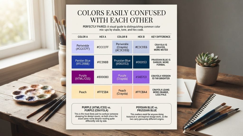
Purple (HTML/CSS) and Purple (Crayola) get mixed up constantly too, since both share a name, but the Crayola version runs far brighter and more saturated than the deep, muted CSS standard. Peach and Peach (Crayola) also blur together, though the Crayola version leans slightly more orange and less pale.
The table below lines up the clearest pairs directly so the difference is easy to see at a glance. Pay attention to the RGB numbers, not just the names, since two colors can look nearly identical in a small swatch but read very differently once scaled up.
| Color A | Hex A | Color B | Hex B | Key Difference |
| Periwinkle | #CCCCFF | Periwinkle (Crayola) | #C3CDE6 | Crayola version is grayer and more muted |
| Persian Blue | #1C39BB | Prussian Blue | #003153 | Prussian Blue is darker, more formal |
| Purple (HTML/CSS) | #800080 | Purple (Crayola) | #9457EB | Crayola version is far brighter |
| Peach | #FFE5B4 | Peach (Crayola) | #FFCBA4 | Crayola version leans more orange |
Purple (HTML/CSS) versus Purple (Crayola) is the pair most likely to confuse someone shopping for design assets, since both share the exact same name despite reading quite differently side by side. Persian Blue versus Prussian Blue matters most for anyone doing historical or art-inspired design work, since the two colors carry genuinely different origins despite sitting close together on the color wheel.
Master Alphabetical List of P Colors
This list includes standard CSS/X11 names, Crayola-official names, Pantone references, and long-documented traditional and historical names. Standard CSS/X11 names are marked with an asterisk, since those carry a single, universally agreed hex code. Every other name below is still verified against its cited source, though minor variation can exist across informal color-naming sites.

- Pacific Blue — #1CA9C9
- Pakistan Green — #006600
- Palatinate Purple — #682860
- Pale Aqua — #BED3E5
- Pale Cerulean — #9BC4E2
- Pale Dogwood — #ED7A9B
- PaleGoldenrod* — #EEE8AA
- PaleGreen* — #98FB98
- Pale Pink — #FADADD
- Pale Purple (Pantone) — #FAE6FA
- Pale Spring Bud — #ECEBBD
- PaleTurquoise* — #AFEEEE
- PaleVioletRed* — #DB7093
- Pansy Purple — #78184A
- Paolo Veronese Green — #009B7D
- PapayaWhip* — #FFEFD5
- Paradise Pink — #E63E62
- Parchment — #F1E9D2
- Paris Green — #50C878
- Pastel Pink — #DEA5A4
- Paua — #1F005E
- Payne’s Grey — #536878
- Peach — #FFE5B4
- Peach (Crayola) — #FFCBA4
- PeachPuff* — #FFDAB9
- Peacock Blue — #006380
- Pear — #D1E231
- Pearl — #EAE0C8
- Pearl Aqua — #88D8C0
- Pearly Purple — #B768A2
- Perano — #94B1FF
- Peridot — #E6E200
- Periwinkle — #CCCCFF
- Periwinkle (Crayola) — #C3CDE6
- Persian Blue — #1C39BB
- Persian Green — #00A693
- Persian Indigo — #32127A
- Persian Orange — #D99058
- Persian Pink — #F77FBE
- Persian Plum — #701C1C
- Persian Red — #CC3333
- Persimmon — #EC5800
- Peru* — #CD853F
- Pewter — #96A8A1
- Pewter Blue — #8BA8B7
- Phlox — #DF00FF
- Phthalo Blue — #000F89
- Phthalo Green — #123524
- Picotee Blue — #2E2787
- Piggy Pink — #FDDDE6
- Pine Green — #01796F
- Pine Tree — #2A2F23
- Pink* — #FFC0CB
- Pink Lace — #FFDDF4
- Pink Lavender — #D8B2D1
- Pink Sherbet — #F78FA7
- Pink Flamingo — #FC74FD
- Pink Pearl — #E7ACCF
- Pistachio — #93C572
- Platinum — #E5E4E2
- Plum* — #DDA0DD
- Portland Orange — #FF5A36
- PowderBlue* — #B0E0E6
- Prussian Blue — #003153
- Puce — #CC8899
- Pumpkin — #FF7518
- Purple (HTML/CSS)* — #800080
- Purple (Crayola) — #9457EB
- Purple Heart — #69359C
- Purple Mountain Majesty — #9678B6
- Purple Navy — #4E5180
- Purple Pizzazz — #FE4EDA
- Purple Plum — #9C51B6
- Purple Taupe — #50404D
- Purpureus — #9A4EAE
Notice how many entries carry “Persian,” “Pale,” or “Purple” as a root word, together making up nearly a third of this entire letter group. That concentration reflects just how many independent naming traditions, from Crayola to Pantone to historic pigment records, have each contributed their own version of these popular hues.
Hex/RGB Crosswalk: Why Exact Codes Matter
A color name alone isn’t enough for real design work. Two designers using “purple” without a hex code might land on two noticeably different shades. That’s why any serious project needs the exact hex or RGB value locked in before production starts.

Hex codes matter most for web and app design, since browsers read hex values directly. RGB values matter more for video, screen graphics, and design software that calculates color mathematically. The table below gives both formats for five of the most frequently searched colors that start with P, so you can copy whichever your tool requires.
| Color | Hex | RGB |
| Pink | #FFC0CB | 255, 192, 203 |
| Purple (HTML/CSS) | #800080 | 128, 0, 128 |
| Peach | #FFE5B4 | 255, 229, 180 |
| Prussian Blue | #003153 | 0, 49, 83 |
| Periwinkle | #CCCCFF | 204, 204, 255 |
Purple’s RGB values show equal red and blue channels with zero green, which is exactly what gives it that balanced, formal depth. Prussian Blue, by contrast, keeps all three channels low with blue dominant, producing its deep, historic intensity rather than anything bright or soft.
Full Comparison Table: All 75 P Colors
This table brings every color from the alphabetical list together with hex, RGB, color family, and common use. Use the family column to quickly find colors that will sit well together in a single palette, and use the common use column to match a color to your actual project type.
| Color | Hex | RGB | Family | Common Use |
| Pacific Blue | #1CA9C9 | 28, 169, 201 | Blue | Coastal, travel branding |
| Pakistan Green | #006600 | 0, 102, 0 | Green | Cultural, national branding |
| Palatinate Purple | #682860 | 104, 40, 96 | Purple | Formal historic accent |
| Pale Aqua | #BED3E5 | 190, 211, 229 | Blue | Soft pastel background |
| Pale Cerulean | #9BC4E2 | 155, 196, 226 | Blue | Calm pastel accent |
| Pale Dogwood | #ED7A9B | 237, 122, 155 | Pink | Pantone soft fashion accent |
| PaleGoldenrod | #EEE8AA | 238, 232, 170 | Yellow | Soft pastel background |
| PaleGreen | #98FB98 | 152, 251, 152 | Green | Fresh, gentle accent |
| Pale Pink | #FADADD | 250, 218, 221 | Pink | Bridal, soft background |
| Pale Purple (Pantone) | #FAE6FA | 250, 230, 250 | Purple | Delicate pastel accent |
| Pale Spring Bud | #ECEBBD | 236, 235, 189 | Yellow/Green | Soft seasonal accent |
| PaleTurquoise | #AFEEEE | 175, 238, 238 | Blue/Green | Calm pastel accent |
| PaleVioletRed | #DB7093 | 219, 112, 147 | Pink | Soft fashion accent |
| Pansy Purple | #78184A | 120, 24, 74 | Purple | Bold floral accent |
| Paolo Veronese Green | #009B7D | 0, 155, 125 | Green | Artistic, historic accent |
| PapayaWhip | #FFEFD5 | 255, 239, 213 | Neutral | Pale warm background |
| Paradise Pink | #E63E62 | 230, 62, 98 | Pink | Bold Pantone accent |
| Parchment | #F1E9D2 | 241, 233, 210 | Neutral | Vintage warm background |
| Paris Green | #50C878 | 80, 200, 120 | Green | Historic pigment accent |
| Pastel Pink | #DEA5A4 | 222, 165, 164 | Pink | Soft muted accent |
| Paua | #1F005E | 31, 0, 94 | Purple | Deep regional accent |
| Payne’s Grey | #536878 | 83, 104, 120 | Blue/Gray | Artistic mixing color |
| Peach | #FFE5B4 | 255, 229, 180 | Neutral/Orange | Gentle warm background |
| Peach (Crayola) | #FFCBA4 | 255, 203, 164 | Orange | Playful crayon-toned accent |
| PeachPuff | #FFDAB9 | 255, 218, 185 | Neutral/Orange | Soft warm background |
| Peacock Blue | #006380 | 0, 99, 128 | Blue | Rich, saturated accent |
| Pear | #D1E231 | 209, 226, 49 | Green/Yellow | Fresh food-inspired accent |
| Pearl | #EAE0C8 | 234, 224, 200 | Neutral | Elegant warm background |
| Pearl Aqua | #88D8C0 | 136, 216, 192 | Green/Blue | Soft calming accent |
| Pearly Purple | #B768A2 | 183, 104, 162 | Purple | Soft fashion accent |
| Perano | #94B1FF | 148, 177, 255 | Blue | Bright modern accent |
| Peridot | #E6E200 | 230, 226, 0 | Yellow/Green | Gemstone-inspired accent |
| Periwinkle | #CCCCFF | 204, 204, 255 | Purple/Blue | Calm, nostalgic branding |
| Periwinkle (Crayola) | #C3CDE6 | 195, 205, 230 | Purple/Blue | Muted pastel accent |
| Persian Blue | #1C39BB | 28, 57, 187 | Blue | Historic rich accent |
| Persian Green | #00A693 | 0, 166, 147 | Green | Cultural, rich accent |
| Persian Indigo | #32127A | 50, 18, 122 | Purple | Deep dramatic accent |
| Persian Orange | #D99058 | 217, 144, 88 | Orange | Warm muted accent |
| Persian Pink | #F77FBE | 247, 127, 190 | Pink | Bold fashion accent |
| Persian Plum | #701C1C | 112, 28, 28 | Red/Brown | Deep formal accent |
| Persian Red | #CC3333 | 204, 51, 51 | Red | Bold cultural accent |
| Persimmon | #EC5800 | 236, 88, 0 | Orange | Bold food-inspired accent |
| Peru | #CD853F | 205, 133, 63 | Brown | Warm neutral background |
| Pewter | #96A8A1 | 150, 168, 161 | Gray | Sophisticated metallic neutral |
| Pewter Blue | #8BA8B7 | 139, 168, 183 | Blue/Gray | Muted professional accent |
| Phlox | #DF00FF | 223, 0, 255 | Purple/Pink | Bold electric accent |
| Phthalo Blue | #000F89 | 0, 15, 137 | Blue | Fine art pigment |
| Phthalo Green | #123524 | 18, 53, 36 | Green | Fine art pigment |
| Picotee Blue | #2E2787 | 46, 39, 135 | Blue/Purple | Bold Crayola accent |
| Piggy Pink | #FDDDE6 | 253, 221, 230 | Pink | Soft playful accent |
| Pine Green | #01796F | 1, 121, 111 | Green | Deep natural accent |
| Pine Tree | #2A2F23 | 42, 47, 35 | Green/Brown | Dark natural accent |
| Pink | #FFC0CB | 255, 192, 203 | Pink | Beauty, youth branding |
| Pink Lace | #FFDDF4 | 255, 221, 244 | Pink | Delicate pastel accent |
| Pink Lavender | #D8B2D1 | 216, 178, 209 | Pink/Purple | Soft romantic accent |
| Pink Sherbet | #F78FA7 | 247, 143, 167 | Pink | Playful dessert-inspired accent |
| Pink Flamingo | #FC74FD | 252, 116, 253 | Pink | Bold vibrant accent |
| Pink Pearl | #E7ACCF | 231, 172, 207 | Pink | Elegant soft accent |
| Pistachio | #93C572 | 147, 197, 114 | Green | Food-inspired soft accent |
| Platinum | #E5E4E2 | 229, 228, 226 | Neutral | Sophisticated metallic neutral |
| Plum | #DDA0DD | 221, 160, 221 | Purple | Soft romantic accent |
| Portland Orange | #FF5A36 | 255, 90, 54 | Orange | Bold energetic accent |
| PowderBlue | #B0E0E6 | 176, 224, 230 | Blue | Soft calming background |
| Prussian Blue | #003153 | 0, 49, 83 | Blue | Formal, historical branding |
| Puce | #CC8899 | 204, 136, 153 | Pink/Brown | Vintage muted accent |
| Pumpkin | #FF7518 | 255, 117, 24 | Orange | Bold seasonal accent |
| Purple (HTML/CSS) | #800080 | 128, 0, 128 | Purple | Luxury, creative branding |
| Purple (Crayola) | #9457EB | 148, 87, 235 | Purple | Bright playful accent |
| Purple Heart | #69359C | 105, 53, 156 | Purple | Bold formal accent |
| Purple Mountain Majesty | #9678B6 | 150, 120, 182 | Purple | Soft scenic accent |
| Purple Navy | #4E5180 | 78, 81, 128 | Purple/Blue | Muted formal accent |
| Purple Pizzazz | #FE4EDA | 254, 78, 218 | Pink/Purple | Bold electric accent |
| Purple Plum | #9C51B6 | 156, 81, 182 | Purple | Rich fashion accent |
| Purple Taupe | #50404D | 80, 64, 77 | Purple/Brown | Sophisticated neutral accent |
| Purpureus | #9A4EAE | 154, 78, 174 | Purple | Bold historic accent |
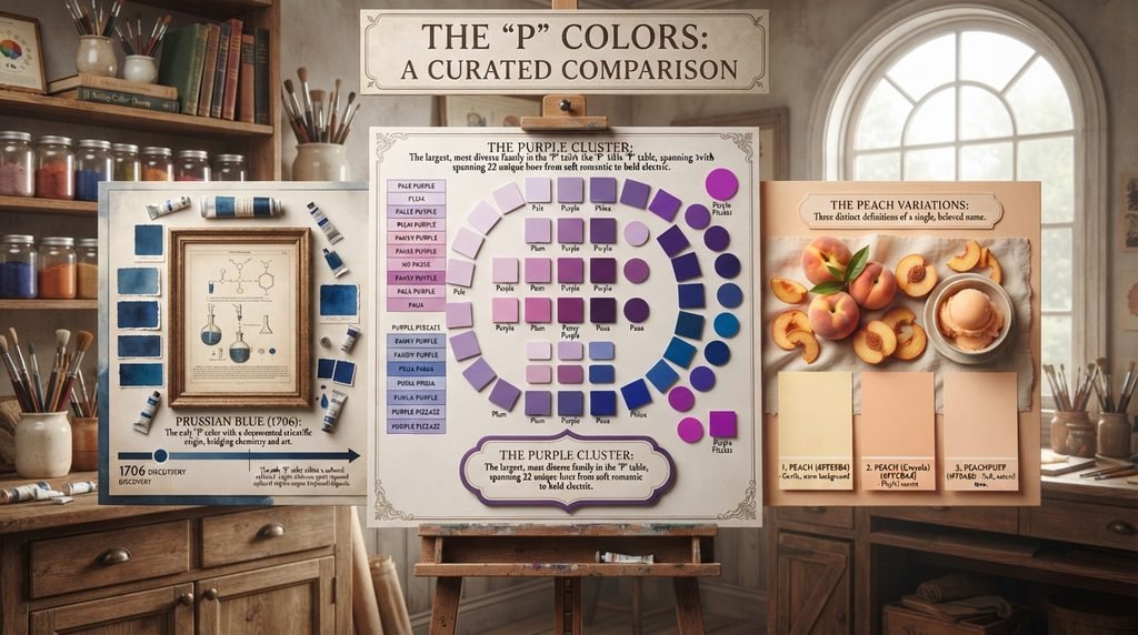
A few rows deserve a second look. The many Purple-family variants together make up the largest single cluster on this entire table, spanning from the muted CSS standard to the electric Purple Pizzazz. Prussian Blue stands out as the only entry with a documented scientific discovery date, unlike most other colors on this list drawn from nature or tradition. Peach, in all three of its documented variants, proves how much even a single, seemingly simple color name can shift depending on the source defining it.
Decision-Flow Table: Picking the Right P Color
Choosing between seventy-five similar-sounding names gets easier with a clear project goal in mind. The table below matches common use cases to a recommended color that starts with P, so you can skip the guesswork and go straight to a shade that fits the job.

| If you need… | Pick this color | Why |
| A soft beauty or lifestyle brand | Pink or Pink Sherbet | Gentle, approachable, universally liked |
| A luxury or creative brand | Purple (HTML/CSS) | Rich, established, tied to royal history |
| A formal, historical design project | Prussian Blue or Persian Blue | Rooted in genuine pigment or dye history |
| A gentle, warm background tone | Peach or Parchment | Soft, versatile, easy to pair |
| A bold, high-energy accent | Purple Pizzazz or Pink Flamingo | Impossible to miss |
| A calm, nature-inspired palette | Pine Green or Pistachio | Grounded, fresh, natural |
| A sophisticated metallic neutral | Pewter or Platinum | Cool, refined, versatile |
Use this table as a starting point rather than a final answer. A palette built entirely around Purple, for instance, often benefits from a neutral like Pearl or Platinum alongside it to keep the overall design from feeling too heavy. Pair the recommended color with a calmer neutral from the comparison table above for a balanced result.
Conclusion
Colors that start with P stretch further than almost any other letter, from the gentle warmth of Peach to the deep history of Prussian Blue. This list sticks to 75 verified names with real hex and RGB codes, so nothing here is guesswork or padding. Whether you’re building a brand, mixing paint, or just curious, these colors that start with P give you a solid, checkable starting point.
Frequently Asked Questions
How many colors actually start with the letter P?
This guide covers 75 verified colors that start with P, drawn from CSS/X11 standards, Crayola’s official naming, Pantone references, and documented historical pigments. Larger lists claiming 150 or more usually include unverifiable entries from unreliable fan-made color charts.
What are some common colors that start with P?
Pink, Purple, Peach, Periwinkle, and Prussian Blue are among the most recognized. Each has a fixed hex code and shows up regularly in design, fashion, and branding.
Is Pink a real CSS color?
Yes. Pink is a standard CSS/X11 color with the hex code #FFC0CB, one of the most universally recognized named colors in web design.
Why are there two different Purple colors?
Purple (HTML/CSS), hex #800080, is the deep, muted CSS standard, while Purple (Crayola), hex #9457EB, runs far brighter and more saturated, reflecting Crayola’s independent calibration.
What color is Prussian Blue exactly?
Prussian Blue is a deep, historic blue with the hex code #003153, discovered by accident around 1706 as the first modern synthetic pigment.
Is Puce really named after an insect?
Yes. Puce, hex #CC8899, takes its name from the French word for flea, referencing the reddish-brown stain left behind by a crushed flea.
What’s the difference between Peach and Peach (Crayola)?
Peach, hex #FFE5B4, stays pale and soft, while Peach (Crayola), hex #FFCBA4, leans noticeably more orange and saturated.